Website Form Design Best Practices: Fewer Fields, More Leads
A practical guide to web form design for small businesses: cut fields, write better errors, use autocomplete, and turn more visitors into qualified leads.
A form is the place where the visitor finally has to commit. Everything before it — the headline, the proof, the photos, the price — has been free. The form is the point where they hand you their name, their phone number, and a quiet bet that you will not waste them.
Most small business forms make that bet harder than it needs to be. They ask for nine fields when three would do. They reject phone numbers that have a space in them. They mark "company name" as required for a homeowner. They show a single red sentence at the top of the page when the visitor mistypes a postcode and call it an error message. Each one costs leads, and almost none of them cost much to fix.
This is the field-by-field guide to forms that actually convert, written from the perspective of a senior designer who has watched too many service businesses lose qualified leads to a "Submit" button that did nothing.
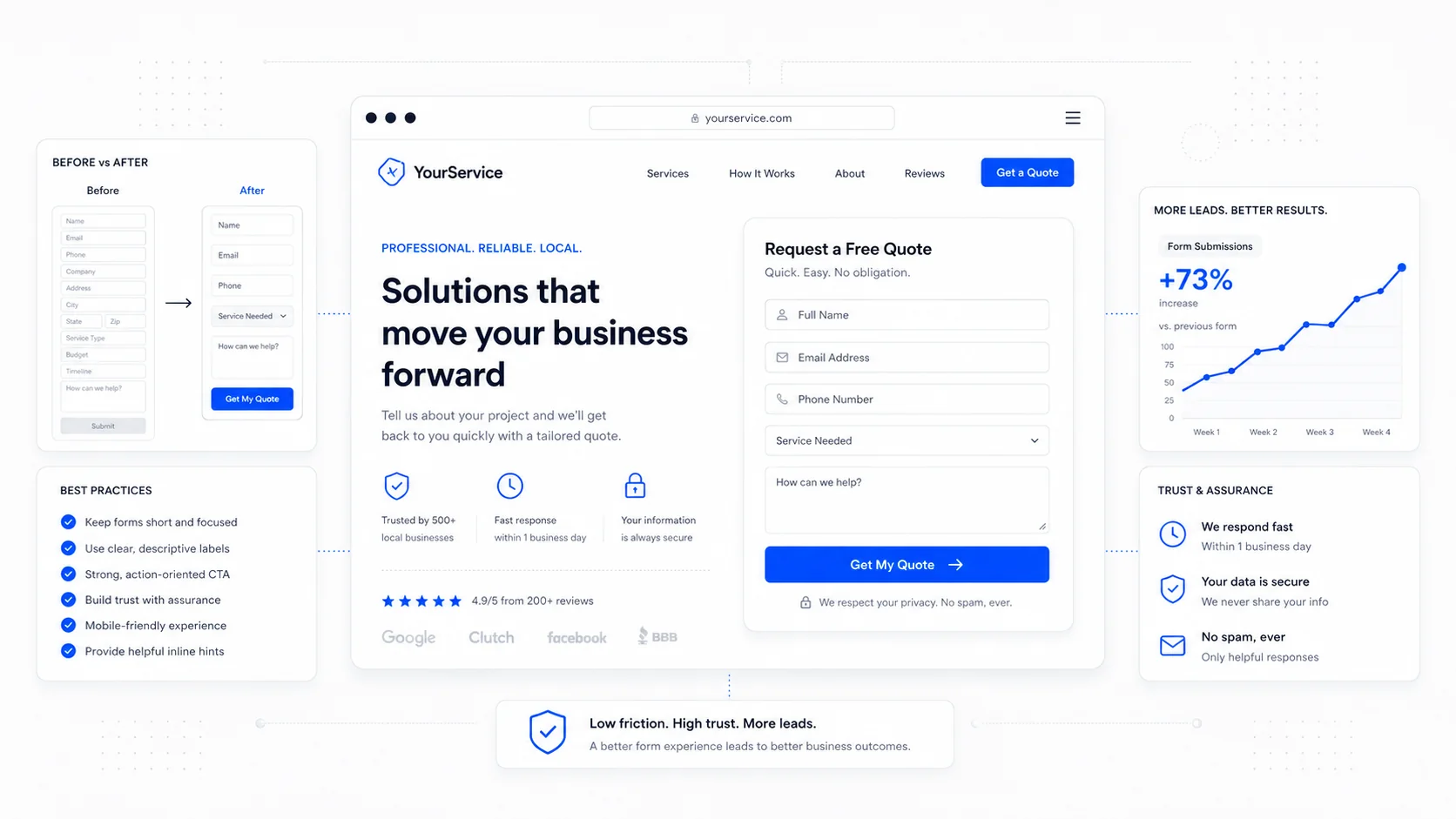
Start by Cutting Fields
The single highest-leverage change you can make to a form is to remove fields. Every additional field measurably reduces completion rate, and most of the fields on a typical small business form do not change what the team does next.
Baymard Institute's long-running checkout usability research is the most-cited body of evidence here, and the pattern is consistent across industries: average forms can drop a third or more of their fields without losing any operational value. The exact numbers vary, but the direction never does. Fewer fields means more completions.
A useful test for every field on your form:
- Does the answer change which team member responds?
- Does it change the price you quote?
- Does it change whether you take the job?
- Will you actually read it before you reply?
If none of those are true, the field is decoration. Remove it.
For most service businesses, the right starting form is name, contact method, and one qualifying question. Service type and timeline can usually be inferred from the page the visitor came from or asked over the phone in the first reply. The conversion-focused design work we do for clients almost always starts with a field audit, because cutting a form from eight fields to four is faster than redesigning the page around it.
Use the Right Input Type for Every Field
This is the smallest, most ignored detail in form design, and it pays off on every single mobile visit. The HTML input element has a long list of types — email, tel, number, url, date — and each one tells the browser to show the right keyboard, run the right validation, and trigger the right autofill.
The MDN documentation on the input element is the canonical reference, and the rules are not complicated. A phone field with type="tel" shows the phone keypad on mobile. An email field with type="email" shows the keyboard with @ and .com. A numeric field with inputmode="numeric" shows digits without forcing a strict number-only validator.
Pair the right type with autocomplete attributes and the form will fill itself for most returning visitors. The WHATWG autocomplete spec lists the standard tokens, but the everyday set is short:
autocomplete="name"for full name.autocomplete="given-name"andautocomplete="family-name"if you split it.autocomplete="email"for email.autocomplete="tel"for phone.autocomplete="street-address",autocomplete="postal-code",autocomplete="address-level2"for addresses.
Forms with proper autocomplete annotations complete faster and have lower error rates, particularly on mobile. The WCAG 2.1 success criterion 1.3.5 on identifying input purpose is essentially the accessibility framing of the same thing — naming the purpose of each field is good for assistive tech and for the autofill engine in every modern browser.
Validate Inline, Not at Submit
The classic broken form: you fill in eight fields, hit Submit, and a red banner appears at the top of the page telling you "There were errors with your submission." You scroll up, scroll down, hunt for the red field, fix it, hit Submit again, and find another one.
Inline validation — checking each field as the user finishes it — is the standard fix, but it is easy to do badly. Validating on every keystroke punishes people who are still typing. Validating only after Submit is the broken default. The pattern that works is to validate when the user moves on from the field, usually on blur, and to do it in a way that does not feel like an accusation.
Nielsen Norman Group's guide to inline validation lays out the principles clearly: validate at the moment the user can act on the feedback, show the error next to the field that caused it, and write the message so it explains how to fix the problem rather than scolding the visitor for making it.
A few practical rules:
- Validate on
blur, not on every keystroke, except for password strength meters and similar progressive UIs. - Show the success state too, especially for fields with strict formats (postal code, account number, phone), so the user knows they got it right.
- Re-validate on
inputonce a field has been marked invalid, so the error clears the moment they fix it. - Never strip the user's input silently. If a phone number has spaces or dashes, accept it and normalise on the server.
The last point is the easiest one to fix and the most under-appreciated. A form that rejects "(403) 555-1234" because it expected "4035551234" is a form that wastes its visitors' time. Normalise on the backend; accept what the human typed.
Write Error Messages a Human Would Say Out Loud
"Invalid input." "This field is required." "Please enter a valid email address."
Default error copy is the lowest-effort, highest-impact thing on most forms. It costs nothing to rewrite and it changes the way the form feels.
Useful patterns from GOV.UK's design system error guidance, which is one of the most carefully tested sets of form components in production:
- Be specific about what went wrong. "Enter your full postal code, for example T2P 0V8" beats "Invalid postal code."
- Tell the user what to do, not what they did wrong. "Enter an email address in the format name@example.com" beats "Email address is invalid."
- Use the user's words. If the field is labelled "Phone number," the error should say "phone number," not "telephone."
- Keep it calm. The error is a signal, not a punishment.
When errors do happen, surface them in the form itself, not just in a banner at the top. The WCAG 2.2 success criterion 3.3.3 on error suggestion requires that errors include a suggested correction when one is known. Inline messages with clear instructions satisfy that and serve every visitor at the same time.
Multi-Step or Single-Step? It Depends on the Question
The "should I use a multi-step form?" debate is one of the most-tested questions in form design, and the honest answer is: it depends on what you are asking for.
A multi-step form generally outperforms a single long form when:
- You need more than five or six fields.
- The fields fall into natural groups (contact info, project details, scheduling).
- The first step is the easiest one (name and email), so the visitor commits before they see the long part.
- The form is on a landing page where you are paying for the click and the percentage matters.
A single-step form generally wins when:
- The form is short (three to four fields).
- The visitor expects a quick interaction (newsletter signup, callback request).
- The audience is highly motivated and the form is on a "Contact" page they already navigated to deliberately.
CXL's research on multi-step forms summarises the trade-offs well: progress indicators reduce abandonment, the first-step effect is real, and the gain comes from the perceived shortness, not the actual data collected. If you split a long form into three steps, you collect the same data in the same time, but completion goes up because each screen feels small.
The pattern we use for SEO-focused website builds that target paid traffic is two or three short steps with a visible progress bar, the lightest qualifying question first, and contact details last. The visitor commits before they realise they have committed.
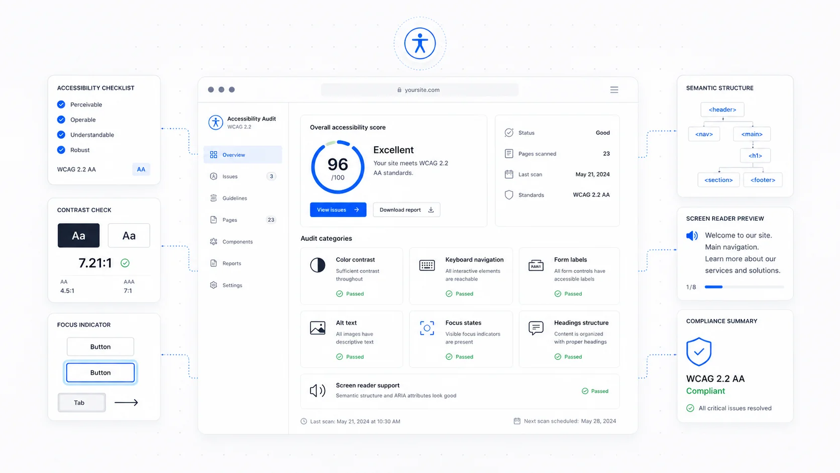
Make the Form Reachable by Keyboard and Screen Reader
Forms are where accessibility either works or fails. A poorly built form is unusable for any visitor who cannot use a mouse or who relies on a screen reader, and it is also fragile for everyone else.
The basics, drawn from the W3C ARIA Authoring Practices and the WebAIM forms guide, are not optional:
- Every input must have a real
<label>element associated with it viaforandid. Placeholder text is not a label. - The tab order must follow the visual order. If the visitor presses Tab, they should land on the next visible field, not jump across the page.
- Required fields should be marked with the
requiredattribute, not just an asterisk in the label. - Error messages should be linked to the input with
aria-describedbyso screen readers announce them. - Focus styles must be visible. Removing the focus ring without replacing it is one of the most common accessibility regressions in modern designs.
Test the form with a keyboard. Tab through every field, fill it in, submit it, hit an error, recover from it. If anything in that sequence is awkward, it is awkward for everyone, not just users with disabilities.
Respect Mobile Constraints
Most service business forms are completed on a phone. Designing for that reality means more than shrinking the desktop form.
Practical mobile rules:
- Inputs should be at least 44 pixels tall, in line with the Apple Human Interface Guidelines on touch targets.
- Font size on inputs should be at least 16 pixels, otherwise iOS Safari will zoom the page on focus, which is jarring and easy to avoid.
- Fields should stack in a single column. Multi-column forms on mobile look tidy in a screenshot and are miserable to fill in on a thumb.
- The Submit button should be wide, sit above the fold of the keyboard, and be easy to hit without contortion.
- Avoid CAPTCHAs that require image puzzles on mobile if you can. Modern alternatives like Cloudflare Turnstile handle bot prevention without forcing the visitor to identify traffic lights.
A useful gut check: fill in your own form on your own phone in the back seat of a car. Anything that frustrates you in those two minutes is what will quietly kill your conversion rate.
Send the Right Confirmation
The form ends at the confirmation, not at the submit. A vague "Thank you" page is a missed chance to manage expectations.
A good post-submit experience does three things:
- Confirms the message was received, with a specific reference if applicable.
- Tells the visitor what happens next ("We reply within one business day, usually faster on weekday mornings").
- Gives them a useful next step — a relevant article, a phone number to call if it is urgent, or a link back to a popular page.
Send the same information by email immediately. A confirmation email reduces the "did it actually go through?" follow-up and reassures the visitor that they are in your system. If your sales process needs it, schedule an automatic follow-up the next morning so the lead does not go cold over a weekend.
A Practical Action List
If you have read this far, the smallest set of changes you can make this week is short:
- Cut every field that does not change what your team does next.
- Add
typeandautocompleteattributes to every input. - Move validation inline, on
blur, with messages that explain how to fix the problem. - Make sure every input has a real label and a visible focus state.
- Test the form on your own phone, end to end, including the confirmation.
- Replace the generic thank-you page with one that names the next step and the response time.
None of this requires a redesign. None of it requires a new platform. It is a quiet, careful pass over the form you already have, in the same spirit as our trust signal checklist — small, specific edits that compound into measurable conversion gains.
If your forms are doing the heavy lifting in your sales pipeline and you want a second pair of eyes, get in touch. We build forms that respect the visitor's time and the business's intake process, and the difference shows up in the lead quality, not just the count.
More posts from the blog.
The AI Chat Widget Decision: When It Helps Leads and When It Hurts Trust
AI chat widgets can qualify leads and answer common questions, but they can also slow the site, invent answers, mishandle privacy, and damage trust. Here is how to decide.
Fast Loads, Slow Clicks: Why INP Is the Performance Metric Business Owners Should Care About
A plain-English guide to Interaction to Next Paint (INP): why fast-loading pages can still feel broken, what causes slow clicks, and how to fix the interactions that cost leads.
Accessibility Overlays Are Not a Compliance Plan: What Business Owners Should Do Instead
Accessibility overlay widgets promise one-line compliance, but real accessibility comes from fixing the website itself: markup, contrast, keyboard support, forms, content, and testing.
Keep reading?
More field notes from building modern websites and software for real businesses.