Website Trust Signals: 12 Things That Increase Conversions Without Redesigning
A practical checklist of website trust signals small businesses can add to an existing site to increase conversions without a full redesign or rebuild.
Most small business websites do not have a design problem. They have a trust problem. The visitor lands, the offer makes sense, and they leave because something quiet was missing — a name, a face, a real address, a recent review, a clear answer to "is this a real business that will treat me well?"
The good news is that almost every trust signal can be added to a site you already have. No rebuild, no new platform, no rebrand. Below are twelve of the highest-leverage signals to consider.
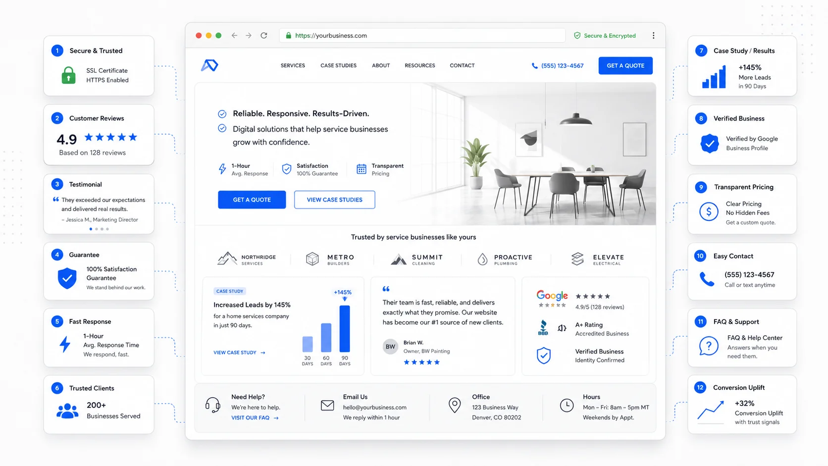
1. Real Names and Real Faces
Stock photos of generic happy people quietly tell visitors the business is hiding. A photo of the actual owner, technician, or team almost always outperforms it. A few practical fixes:
- Replace the stock hero image with a real photo from a recent job.
- Add a short owner photo and bio to the About page.
- Show team photos with first names on the contact or services pages.
Nielsen Norman Group's research on faces in web design is consistent: real faces draw attention and increase trust, while generic stock imagery is largely ignored.
2. A Real Physical Address and Local Phone Number
For a local service business, an address and a local area code are credibility cues, not just contact details. They tell the visitor the business exists in a real place. Include in the footer of every page:
- Full street address (or service area if you do not have a storefront).
- Local phone number, formatted as a tappable link on mobile.
- Hours of operation.
- A static map or a link to the Google Business Profile.
The conversion impact comes from the simple fact that the visitor stops wondering whether the business is real.
3. Specific Testimonials, Not Generic Praise
"Great service, highly recommend!" is almost worthless as a trust signal. A testimonial that names the customer, the problem, and the outcome is dramatically more persuasive. A good testimonial usually includes:
- The customer's full first name and last initial, plus city if relevant.
- The specific service they used.
- The problem they had before.
- The result they got.
- A photo, where appropriate.
If you have great five-star reviews on Google, do not just embed a star rating. Quote the actual sentences that describe the experience.
4. Recent Dates on Reviews and Case Studies
Old social proof can hurt as much as no social proof. A "client review" from 2018 makes the visitor wonder why nothing newer is on display. Easy fixes:
- Show the date next to each testimonial or review.
- Refresh the testimonials section at least once a year.
- Add a recent case study or "recent projects" section that updates naturally.
The Mathis Moving project page is a good example — a recent rebuild with the specific business problem and the measurable change sits in front of the visitor instead of behind a generic portfolio.
5. A Real "About" Page With a Story
The About page is one of the most-visited pages on most small business websites, and one of the most underused. Visitors go there to find out who is behind the business before they fill out a form. A trust-building About page usually has:
- A short founding story (why the business exists).
- A photo of the owner or team.
- Specifics: how long in business, how many clients, where the team works.
- Values stated as actions, not slogans ("We answer every email within one business day" beats "We care about service").
- A clear next step at the bottom of the page.
Visitors who reach the About page are warmer leads than average. The page should treat them that way.
6. Clear, Consistent Contact Options
A trust signal that often gets overlooked: how easy is it to actually reach you? Make sure every page exposes:
- A clickable phone number on mobile.
- An email address that is not hidden behind a contact form.
- A short contact form with sensible fields.
- Expected response time ("We reply within one business day").
If your visitors are mostly mobile, the contact options should not be buried under a hamburger menu.
7. Visible Credentials, Insurance, and Licenses
For service businesses, credentials are a license to be considered. Useful items to display:
- Trade certifications and licenses.
- Insurance and bonding.
- Industry association memberships.
- Years in business.
- Awards or recognitions, with year.
Place them near the offer or near the form, not just in the footer. A "Licensed and insured" line next to the booking button does more work than a logo strip in the footer no one scrolls to.
8. A Clear Process or "How It Works" Section
Buyers want to know what happens after they hit submit. A simple three- to five-step diagram quietly removes a major source of hesitation. A good "How it works" section covers:
- How to start (form, call, quote request).
- What your team does next (review, scheduling, site visit).
- What the client gets (proposal, quote, booking).
- What to expect during the work.
- How it ends (handoff, invoice, follow-up).
This is one of the highest-leverage additions a small business can make to an existing site, and the same idea drives our post on AI automation workflows for service businesses.
9. Security and Privacy Cues
Trust online is partly visual. The lock icon, the privacy policy, the absence of suspicious pop-ups — these are cues visitors check without thinking. Quick wins:
- Make sure the site is fully HTTPS, with no mixed-content warnings.
- Link to a clear, plain-language privacy policy near every form.
- Avoid aggressive pop-ups that feel spammy.
- Use payment processors with recognizable logos if you take payments.
- Show a small "We never share your information" line under the form.
10. Honest Pricing or Pricing Ranges
"Contact us for pricing" is sometimes necessary, but it is also a trust cost. Visitors assume hidden pricing means expensive pricing or a sales process they would rather avoid. Where you cannot publish exact pricing, consider:
- Pricing ranges ("Most projects land between $X and $Y").
- Starting-from prices on services.
- Worked examples ("A typical small move costs around $X for these reasons").
- A clear explanation of what affects the price.
Honest range-based pricing also pre-qualifies leads. It pairs well with SEO-focused website builds where the goal is not just traffic, but the right traffic.
11. Recognizable Logos, Partners, or Press
If your business has worked with recognizable clients, partners, suppliers, or been featured anywhere credible, that belongs near the primary call to action. A logo strip works best when:
- The logos are recent and recognizable to your audience.
- They are in grayscale to avoid visual noise.
- A short caption frames them ("Recent clients" or "Trusted by local businesses").
If you do not have recognizable client logos, industry association badges, supplier partnerships, or media mentions can play the same role.
12. Fast, Reliable Pages
A fast, stable site is itself a trust signal. A page that loads slowly, jumps around, or shows broken images quietly tells the visitor the business may not be reliable either.
Google's Core Web Vitals guidance on web.dev breaks down the experience metrics that matter most. Fixing them is mostly discipline:
- Compress and properly size images.
- Limit third-party scripts and chat widgets.
- Use a modern hosting setup.
- Keep the site updated through ongoing website care and maintenance.
Visitors do not consciously think "this site is well maintained." They just feel it, and they convert at a higher rate when the experience is calm.
How to Use This Checklist
You do not need to do all twelve at once. The most useful approach:
- Walk through your own site as a stranger on a phone.
- Note every moment where you would hesitate.
- Pick the three trust signals that map to those moments.
- Add them this week.
- Re-check in thirty days.
Most small businesses see meaningful conversion improvements from three or four targeted additions, long before a full redesign is discussed. If you are planning broader changes, our SEO-friendly website redesign checklist covers how to layer trust improvements into a larger project without losing what already works.
Final Takeaway
Trust signals are the quiet half of conversion. Visitors rarely tell you they left because the testimonial was vague. They just leave.
The fix is almost never a redesign. It is a series of small, specific edits — real names, real photos, real addresses, recent reviews, clear processes, honest pricing, fast pages — that together make a stranger feel safe enough to take the next step.
Sites That Grow helps small businesses identify and add the trust signals that move the needle, often without a rebuild.
More posts from the blog.

Fast Loads, Slow Clicks: Why INP Is the Performance Metric Business Owners Should Care About
A plain-English guide to Interaction to Next Paint (INP): why fast-loading pages can still feel broken, what causes slow clicks, and how to fix the interactions that cost leads.

Accessibility Overlays Are Not a Compliance Plan: What Business Owners Should Do Instead
Accessibility overlay widgets promise one-line compliance, but real accessibility comes from fixing the website itself: markup, contrast, keyboard support, forms, content, and testing.
Is Your Website Ready for AI Agents? Booking, Quotes, Forms, and Service Pages in 2026
AI agents will expose weak website workflows. Here is how service businesses can make booking, quotes, forms, service pages, and contact paths ready for human and AI-assisted buyers.
Keep reading?
More field notes from building modern websites and software for real businesses.