Conversion-Focused Landing Page Design: Patterns That Actually Convert
Concrete landing page patterns that help small businesses turn more visitors into leads, including hero clarity, single CTAs, social proof, and form design.
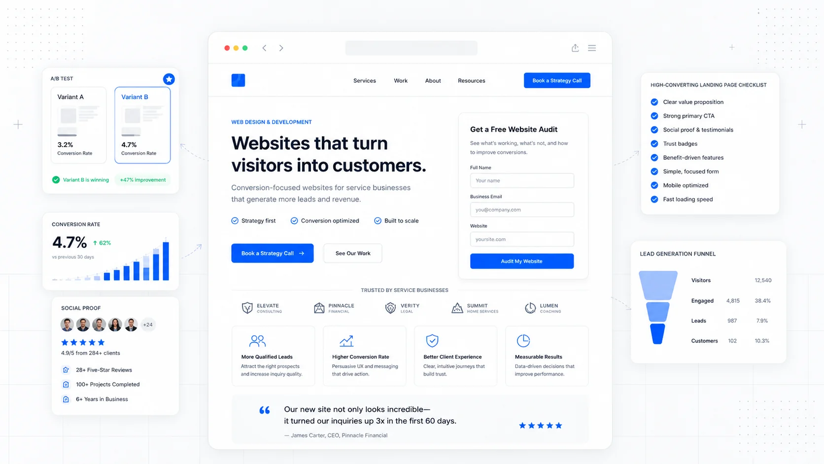
A landing page is not a brochure. It is a single decision point. Someone arrived because of an ad, a search result, or a referral, and the only useful question to ask is whether the page made it easy for them to take the next step.
Most small business landing pages lose visitors not because the design is ugly, but because the page is unclear, asks for too much, or buries the action it wants the visitor to take. The patterns below are the ones that consistently move the needle, and none of them require a full rebrand or a fancy animation library.
Lead With a Hero That Answers Three Questions
A visitor should be able to answer three questions within a few seconds of landing:
- What is this?
- Who is it for?
- What happens if I click the button?
That is the entire job of the hero section. It does not need to be clever. It needs to be specific.
A vague hero like "Building Better Experiences" forces the visitor to scroll, decode, and guess. A specific hero like "Local Moving in Calgary, Booked in Under 5 Minutes" answers the three questions and earns the scroll. Nielsen Norman Group has written extensively about how visitors do scroll, but only after the top of the page convinces them the rest is worth their time.
The hero needs four things to do its job:
- A headline that names the offer in plain language.
- A subheadline that adds the qualifier (location, audience, format).
- One primary call to action.
- A visual that supports the offer instead of competing with it.
Stock photography of generic teams looking at laptops adds nothing. A photo of the actual product, the actual team, or the actual result almost always outperforms it.
Use One Primary CTA, Repeated
Landing pages with five different calls to action almost always convert worse than landing pages with one. Each extra option is a small tax on the visitor's attention.
Pick one primary action: book a call, request a quote, start a trial, download the guide. Repeat that same action two or three times down the page. A secondary action (a phone number, a "learn more" link) can exist, but should be visually quieter.
A useful pattern for service businesses:
- Primary CTA in the hero.
- Primary CTA after the social proof section.
- Primary CTA at the end of the page.
- Sticky CTA on mobile so it never disappears.
We used this pattern when rebuilding the Mathis Moving website — one offer, one button, repeated at the natural decision points instead of cluttering every section with conflicting links.
Place Social Proof Where Doubt Appears
Social proof works best when it answers a specific objection in the moment the visitor is having it.
That means stop dumping testimonials at the bottom of the page. Instead, place proof next to the claim it supports.
Examples:
- A testimonial about responsiveness next to the "We respond within an hour" promise.
- A logo strip of recognizable clients near the pricing section.
- A specific outcome ("$240 saved on our last move") next to the value claim.
- A short case study near the "How it works" section.
Generic five-star reviews convert worse than a single specific quote that names the person, the problem, and the result.
Real names, real cities, and real photos beat anonymous praise every time.
Reduce Friction Before You Add Persuasion
Most landing pages try to convince when they should be removing obstacles. Friction comes in small forms:
- A form with eight fields when three would do.
- A phone number that is not clickable on mobile.
- A "schedule a call" link that opens a third-party tool with a different brand.
- An unclear price ("contact us for pricing") when a range would qualify the lead.
- A page that takes four seconds to load on a phone.
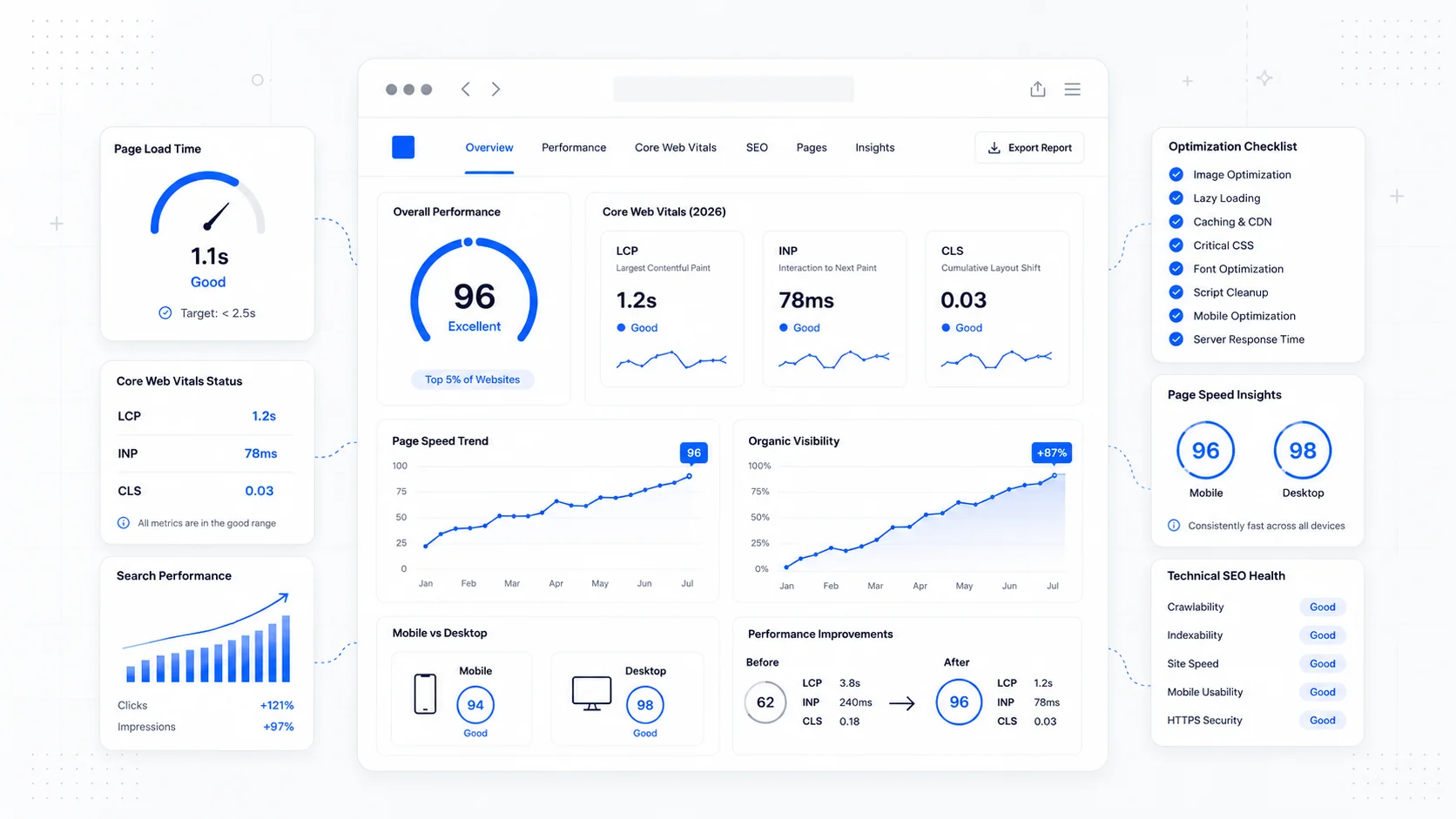
Google's research, summarized on web.dev, is consistent: every additional second of load time costs conversions. Performance is a conversion lever, not just an engineering concern.
A useful exercise: walk through your own landing page on a mid-range Android phone with cellular data. Count every tap, every scroll, every moment of confusion. Each one is a small reason a visitor leaves. This is the same principle behind investing in website care and maintenance — the page only converts if it stays fast and functional after launch.
Match Form Length to the Stage of the Buyer
The right form length is the shortest form that still gives your team enough to act.
A common mistake is to use the same form for cold leads and warm leads. A visitor coming from a cold ad needs a low-commitment form. A visitor on a pricing page is closer to the sale and will tolerate a longer form because they want a real quote.
A practical rule:
- Cold traffic: name, email or phone, one qualifying question.
- Mid-funnel: add service type, timeline, and budget range.
- Pricing or quote pages: full intake form with project details.
Baymard Institute's form usability research consistently shows that fewer fields, clear labels, and inline validation outperform crowded forms with strict requirements. If a field does not change how your team responds, it should not be on the form.
For service businesses, multi-step forms often outperform single long forms because they feel lighter even when they collect the same data. We use this approach on landing pages we build for clients running paid traffic, where every percentage point of conversion matters.
Make Trust Signals Visible Without Being Loud
Trust signals are the small details that tell a visitor your business is real, safe, and accountable.
The list is not glamorous, but it works:
- A real address and phone number in the footer.
- A photo of the actual team or owner.
- Industry certifications, insurance badges, or licenses.
- Recognizable client logos.
- Recent reviews with dates.
- A clear privacy policy linked near the form.
- Visible response times ("We reply within one business day").
These signals matter most for service businesses where the buyer is choosing a person, not just a product. The Sirius Canine Fertility rebuild leaned heavily on credentials and specific outcomes because the audience needed to trust expertise before they would even fill out an inquiry.
Write for Skimmers, Not Readers
Landing page copy should be readable in two passes: a fast skim of headings, and a slower read of details for the small group who keeps going.
Patterns that help skimmers:
- Short paragraphs, never more than three lines.
- Bold the words that carry the meaning.
- Use bullet lists for features, benefits, and steps.
- Use sub-headings every two to three paragraphs.
- Lead each section with the conclusion, not the setup.
If a visitor only reads your headings and bullet points, they should still understand the offer and the next step.
Test the Page Against Real Behavior
Once the page is live, the most useful data is not what the page looks like in a design tool. It is what visitors actually do on it.
Useful signals to track:
- Where visitors stop scrolling.
- Which CTA gets the clicks.
- How many start the form versus complete it.
- Where mobile and desktop conversion rates diverge.
- Which traffic source converts and which does not.
Google's consumer research at Think with Google shows that buyers move quickly between research and decision, and small friction points cost real revenue. A landing page is rarely "done." It is tuned.
Final Takeaway
A landing page that converts is not the result of a clever headline or a fancy animation. It is the result of a clear offer, one obvious next step, proof in the right places, and a fast page that respects the visitor's time.
If your current landing page is underperforming, start with the basics: clarify the hero, cut the form, repeat the CTA, and place proof where doubt lives. Most small businesses get more value from fixing those four things than from a full website redesign.
Sites That Grow designs landing pages and conversion-focused sites for small businesses that need each visit to count. The work starts with the offer, not the layout.
More posts from the blog.
Fast Loads, Slow Clicks: Why INP Is the Performance Metric Business Owners Should Care About
A plain-English guide to Interaction to Next Paint (INP): why fast-loading pages can still feel broken, what causes slow clicks, and how to fix the interactions that cost leads.
Accessibility Overlays Are Not a Compliance Plan: What Business Owners Should Do Instead
Accessibility overlay widgets promise one-line compliance, but real accessibility comes from fixing the website itself: markup, contrast, keyboard support, forms, content, and testing.
Is Your Website Ready for AI Agents? Booking, Quotes, Forms, and Service Pages in 2026
AI agents will expose weak website workflows. Here is how service businesses can make booking, quotes, forms, service pages, and contact paths ready for human and AI-assisted buyers.
Keep reading?
More field notes from building modern websites and software for real businesses.