Mobile-First Design: Why Your Mobile Site Decides Whether You Get the Sale
Most service business websites lose mobile visitors before they reach the contact form. Here is what mobile-first design actually means and what to fix first.
For most small businesses, more than half of the people visiting the website are on a phone. For local services, the number is often higher. That is the audience the site has to win, and it is also the audience most websites quietly lose.
A site that looks great on a 27-inch monitor in a designer's office can still be slow, cramped, and frustrating on a phone in a parking lot. Mobile-first design is not a styling preference. It is a recognition that the phone is the room where the buying decision happens.
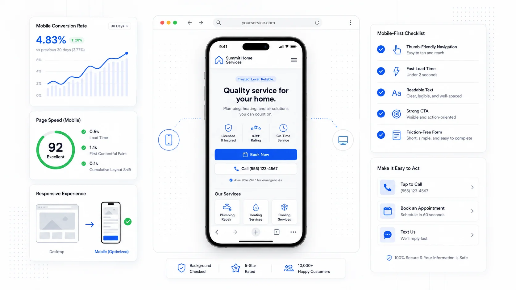
What "Mobile-First" Actually Means
Mobile-first does not mean "we made the desktop site shrink down." It means the design, content, and performance budget were planned for the phone first, and then expanded for larger screens.
The difference shows up in the details:
- The most important action is reachable by thumb.
- The hero offer is readable without zooming.
- The page loads quickly on a 4G connection, not just office Wi-Fi.
- Forms are short, native, and easy to type into.
- Navigation does not hide critical links behind a tiny menu icon.
Google's documentation on mobile-first indexing makes the search side clear: the mobile version of the site is the version Google primarily uses for ranking. If the mobile experience is weaker than the desktop one, both rankings and conversions take the hit.
Where Mobile Visitors Quietly Drop Off
Most mobile drop-off happens in a few predictable places. If you have not watched a real visitor try to use your site on a phone, you are likely guessing about which ones are hurting you.
The common ones:
- The page takes too long to render anything useful.
- The hero text is too small or too long to scan.
- The phone number is not tappable.
- The CTA button is below a giant hero image and missed entirely.
- The contact form has too many fields or a broken keyboard experience.
- A pop-up covers the whole screen and cannot be closed easily.
- Sticky headers, chat widgets, and cookie banners eat half the viewport.
Each of these is small in isolation. Stacked together, they explain why mobile conversion rates are often a fraction of desktop rates on the same site.
Touch Targets: Bigger Than You Think
A button that works fine with a mouse can be a frustration on a phone. Apple and Google both recommend touch targets of around 44 to 48 pixels per side, and Nielsen Norman Group's research on touch target size supports a similar floor.
Practical fixes:
- Make every button a tappable rectangle, not just text.
- Give links and buttons real padding, not just font size.
- Space stacked buttons so the wrong one does not get tapped.
- Make the phone number and email address tappable links, not plain text.
- Replace icon-only buttons with icon-plus-label where the action matters.
A site that respects thumbs converts better than a site that punishes them. We applied this rule throughout the MB Sand homepage redesign — every primary action was sized and placed for the way real customers actually hold a phone.
Speed Is the Conversion Lever Nobody Sees
Mobile users are less patient, on slower connections, and more likely to abandon a slow page. Google's Core Web Vitals guidance on web.dev outlines the metrics that matter most: how quickly the largest content paints, how stable the layout is, and how responsive the page feels to the first interaction.
Most small business sites lose mobile speed in a few common ways:
- Oversized hero images that were never compressed.
- Multiple analytics and chat scripts loaded on every page.
- A hero video that autoplays even on cellular.
- Custom fonts loaded blocking, with no fallback.
- An old page builder that ships unused CSS and JavaScript.
- A theme designed for desktop with mobile bolted on later.
Cutting page weight is often the highest-leverage change a small business can make. A site that goes from four seconds to one and a half seconds on a mid-range Android phone usually sees a meaningful jump in form completions, even with no other change. This is one of the reasons we treat performance as a baseline in every website design and development project rather than a finishing touch.
Forms That Actually Work on a Phone
Mobile form abandonment is one of the biggest hidden conversion killers. The form looks fine in a design tool, but on a real phone it asks for too much, in the wrong order, with the wrong keyboard.
Baymard Institute's form research consistently shows that small mobile changes have outsized effects on completion rates. Useful patterns:
- Use the right input type so the right keyboard appears (email, tel, number).
- Use autocomplete attributes so saved addresses and phone numbers fill in.
- Show inline validation as soon as a field is invalid, not on submit.
- Stack labels above fields, not beside them.
- Avoid placeholder-only labels that disappear when the user taps in.
- Break long forms into short steps with visible progress.
- Make the submit button big, full-width, and unmistakably the next action.
For service businesses running paid traffic to landing pages, form quality on mobile is often the single biggest determinant of cost per lead.
Navigation: Don't Hide the Important Things
A hamburger menu is fine for secondary links. It is a poor place for the action you most want a visitor to take.
For small business sites, the mobile primary navigation should usually expose:
- Phone number (tappable).
- Primary CTA (book, quote, contact).
- One or two highest-intent pages (Services, Pricing).
Burying "Get a Quote" three taps deep in a menu is a quiet way to lose leads. A persistent bottom bar or a sticky CTA bar often outperforms a single hamburger menu, especially for service businesses where the next step is contact, not browsing.
Content Order Matters More on Mobile
On desktop, a wide layout can show three things at once. On mobile, everything is a single stacked column. That changes which things the visitor sees first.
A useful exercise: imagine the mobile page as a scroll of index cards. Visitors will read the first three. Maybe.
So the first three "cards" should be:
- The clear offer (what, who, where).
- The proof that the offer is real (one short testimonial, a recognizable client, a credential).
- The action (CTA button, phone, quick form).
Everything else is bonus. Long credibility sections, detailed FAQs, and team bios still belong on the page, but they should not be sitting between the visitor and the next step.
Test on Real Devices, Not Emulators
Browser emulators are useful, but they lie a little. They do not simulate a slow chip, a flaky cellular signal, a finger smudge on the screen, or the experience of trying to fill out a form one-handed at a job site.
A few habits that catch real problems:
- Open the site on your own phone, on cellular, before considering a redesign launched.
- Hand the phone to someone outside the project and watch them try to book or contact you.
- Test in bright sunlight at least once. Contrast issues become obvious fast.
- Check the page after a soft network throttle to simulate a weak signal.
Mobile users expect speed and clarity, and the gap between that expectation and reality is where conversions quietly disappear.
Final Takeaway
A mobile-first website is not a smaller desktop site. It is a site designed around the way real people actually use phones — quickly, with one thumb, often distracted, often on a slower connection.
If your mobile conversion rate is meaningfully lower than your desktop rate, that gap is rarely about traffic quality. It is almost always about the experience. Fixing the speed, the touch targets, the form, and the placement of the primary CTA usually moves the number more than any redesign of the homepage hero.
Sites That Grow builds mobile-first websites for small businesses that depend on real conversions, not just traffic. If you are not sure where the mobile experience is leaking, that is usually the right place to start before any larger website redesign.
More posts from the blog.

Fast Loads, Slow Clicks: Why INP Is the Performance Metric Business Owners Should Care About
A plain-English guide to Interaction to Next Paint (INP): why fast-loading pages can still feel broken, what causes slow clicks, and how to fix the interactions that cost leads.

Accessibility Overlays Are Not a Compliance Plan: What Business Owners Should Do Instead
Accessibility overlay widgets promise one-line compliance, but real accessibility comes from fixing the website itself: markup, contrast, keyboard support, forms, content, and testing.
Is Your Website Ready for AI Agents? Booking, Quotes, Forms, and Service Pages in 2026
AI agents will expose weak website workflows. Here is how service businesses can make booking, quotes, forms, service pages, and contact paths ready for human and AI-assisted buyers.
Keep reading?
More field notes from building modern websites and software for real businesses.