
Accessibility Overlays Are Not a Compliance Plan: What Business Owners Should Do Instead
Accessibility overlay widgets promise one-line compliance, but real accessibility comes from fixing the website itself: markup, contrast, keyboard support, forms, content, and testing.
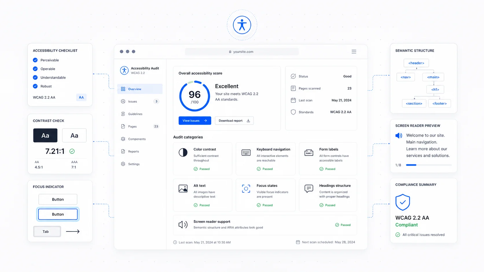
Accessibility overlays are sold with a tempting promise: add one line of JavaScript and your website becomes accessible.
For a busy business owner, that sounds perfect. No redesign. No audit. No hard decisions. A small widget appears in the corner, visitors can change colors or font sizes, and the vendor says the site is now protected.
The problem is that accessibility does not work that way. A widget cannot reliably fix missing form labels, broken keyboard navigation, poor heading structure, inaccessible modals, bad alt text, unlabeled buttons, or a checkout flow that traps focus. Those issues live in the site itself. They need to be fixed in the site itself.
An overlay can be a tool. It is not a compliance plan.
Why Overlays Became Popular
Overlays became popular because accessibility is hard to buy.
Most business owners do not know how to evaluate WCAG. Most agencies do not explain accessibility well. Lawsuits and demand letters sound scary. The owner wants a clear answer: "What do I buy so this is handled?"
Overlay vendors turned that anxiety into a product:
- Low monthly price.
- Fast installation.
- Compliance language.
- Legal-sounding dashboards.
- A visible button that makes the business feel like it did something.
The sales story is strong because the alternative sounds harder: audit the site, fix templates, test components, review content, update forms, train the team, and keep doing it.
But that harder path is the actual work.
The Legal and Standards Context
This is not legal advice. It is a practical summary of where the web has moved.
The stable accessibility standard is still WCAG. WCAG 2.2 is the current W3C recommendation, while many legal and procurement frameworks still reference WCAG 2.1 Level AA. The Department of Justice's 2024 rule for state and local governments under ADA Title II uses WCAG 2.1 Level AA as the technical standard. The European Accessibility Act, enforceable from 2025 for many covered products and services, also pushes accessibility from "nice to have" toward operational requirement.
Private businesses in the United States remain in a more complicated legal environment than state and local governments, but the practical expectation is clear: if your website is how customers access information, request service, book appointments, or buy, accessibility matters.
And if you are going to address it, address it at the source.
What an Overlay Cannot Fix
Overlay widgets can change presentation. They cannot reliably rebuild the meaning and behavior of a broken interface.
Common problems overlays do not truly solve:
- Buttons built as clickable
<div>elements. - Inputs without real labels.
- Menus that cannot be opened by keyboard.
- Modals that do not trap and return focus correctly.
- Error messages that are not announced to screen readers.
- Images missing meaningful alt text.
- Text baked into images.
- Content order that differs from visual order.
- Poorly structured headings.
- Carousels that auto-advance without control.
- PDFs that are inaccessible.
- Low-contrast brand colors used across the design system.
- Chat widgets that cover focused elements.
Some overlays attempt to infer fixes. That is the problem. Accessibility often depends on context.
An image of a team in a homepage hero may be decorative and need empty alt text. A diagram explaining a process needs meaningful alt text or nearby explanation. A product photo needs different text than an icon button. Software cannot always know that from pixels.
Guessing is not remediation.
Start With the Highest-Impact Fixes
The good news is that most small business sites fail in predictable ways.
Start here.
1. Real Form Labels
Every input needs a proper label. Placeholder text is not enough because it disappears as the user types and may not be announced correctly.
Good pattern:
<label for="phone">Phone number</label>
<input id="phone" name="phone" type="tel" />
This helps screen reader users, voice-control users, mobile users, and anyone who returns to a half-completed form after getting distracted.
2. Keyboard Navigation
Open the site. Put your mouse aside. Press Tab.
Can you:
- Reach the menu?
- Open dropdowns?
- See the focus indicator?
- Reach every link and button?
- Submit the form?
- Close popups?
- Escape modals?
- Avoid getting trapped?
If not, fix the components. Do not hide the focus ring because it looks messy. Design a better focus state.
3. Color Contrast
Low-contrast text is one of the most common failures. Light gray text on white may look elegant in a mockup and become unreadable on a phone outside.
WCAG contrast requirements are measurable. Use a contrast checker. Fix body text, buttons, links, disabled states, form borders, badges, and error messages.
4. Heading Structure
Headings are not just visual decoration. They create the outline of the page.
Use one clear H1. Use H2s for major sections. Use H3s for subsections. Do not skip levels because a heading size "looks better." Use CSS for appearance and headings for structure.
5. Link and Button Text
"Click here" and "Learn more" are weak for everyone and especially weak out of context.
Better:
- "Read the website pricing guide."
- "Book a 20-minute audit call."
- "View website maintenance plans."
- "Download the RFP checklist."
Specific link text helps accessibility, SEO, and conversion at the same time.
6. Error Messages
Forms should explain what went wrong and how to fix it.
Bad:
"Invalid."
Better:
"Enter a phone number with at least 10 digits."
Errors should be visible, tied to the field, and announced properly to assistive technology.
Test With Tools, Then With Humans
Automated tools are useful, but limited.
Use:
- Lighthouse.
- axe DevTools.
- WAVE.
- Pa11y.
- Browser keyboard testing.
- Screen reader spot checks.
Automated tests catch many technical issues. They do not tell you whether the writing is clear, whether the process makes sense, whether alt text is meaningful, or whether the mobile experience is comfortable for someone with low vision or motor impairment.
Manual review is still required.
For small business websites, a practical audit can be lightweight:
- Test the homepage, top service pages, contact page, booking page, and highest-traffic blog posts.
- Check keyboard navigation.
- Run automated scans.
- Review forms and errors.
- Check contrast.
- Review headings and landmarks.
- Test mobile.
- Fix templates before fixing one-off pages.
Template fixes matter because they scale. If every service page uses the same broken card component, fix the component once.
Accessibility Is Maintenance
Accessibility can regress.
A new popup covers the form. A new brand color fails contrast. A marketing embed adds unlabeled controls. A booking tool changes its markup. A new page uses headings incorrectly. A PDF gets uploaded without tags.
That is why accessibility should be part of website maintenance, not a once-a-year panic.
Build a simple maintenance checklist:
- Run an accessibility scan after major updates.
- Test keyboard navigation after adding new components.
- Check forms after plugin or integration changes.
- Review contrast when brand colors change.
- Add alt text when images are added.
- Keep PDFs accessible or provide HTML alternatives.
- Include accessibility in launch QA.
This is exactly the kind of work that belongs in a real website care plan.
What to Do If You Already Installed an Overlay
Do not panic. Do not assume you are protected either.
Take these steps:
- Leave it in place temporarily if removing it would create confusion.
- Run an audit of the actual website.
- Fix source issues in templates, components, and content.
- Test with the overlay on and off.
- Decide whether the widget still adds value.
- Avoid marketing claims that imply guaranteed compliance.
In many cases, the best end state is a site that does not need the overlay.
Some users do appreciate controls for font size, contrast, motion reduction, or reading preferences. Those controls can be useful when implemented cleanly. The issue is the compliance claim, not the idea that users may want interface preferences.
The Better Accessibility Plan
A real plan looks like this:
- Audit the important pages.
- Fix semantic HTML.
- Fix keyboard support.
- Fix contrast.
- Fix forms.
- Fix headings.
- Fix media alternatives.
- Fix modals and popups.
- Document known limitations.
- Add accessibility QA to future updates.
- Re-test after meaningful changes.
That is less flashy than a widget. It is also more honest.
Accessibility is not a badge in the corner. It is whether someone can use the site.
For most service businesses, the work is manageable. You do not need to become a standards lawyer overnight. You do need to stop treating accessibility as something a third-party script can magically apply after the fact.
Fix the website. Then keep it fixed.
More posts from the blog.
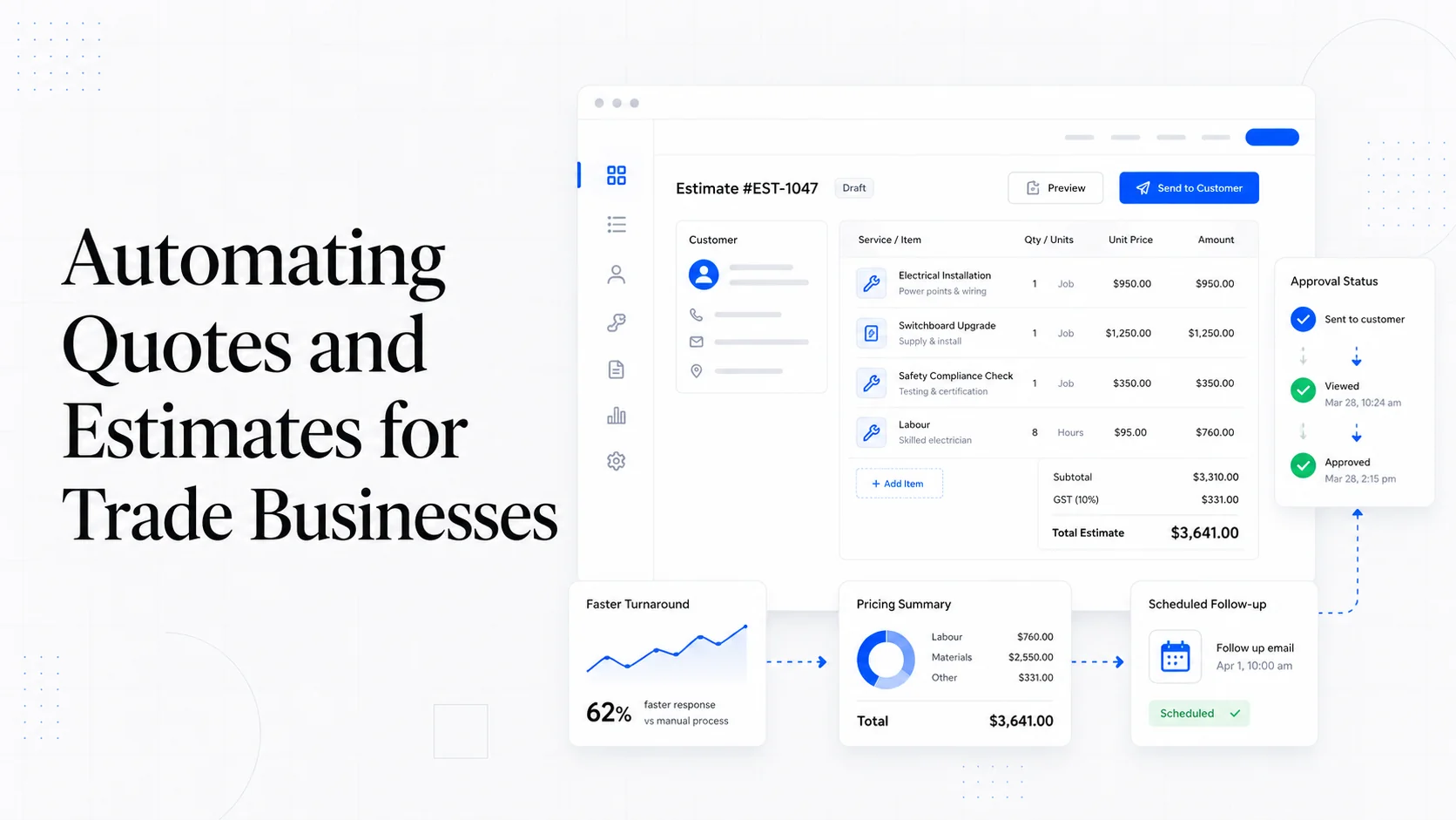
From Contact Form to CRM: The Minimum Lead Pipeline Every Service Business Should Automate
A practical lead pipeline for service businesses: connect forms, calls, email, CRM records, reminders, follow-ups, and reporting so good leads stop disappearing.
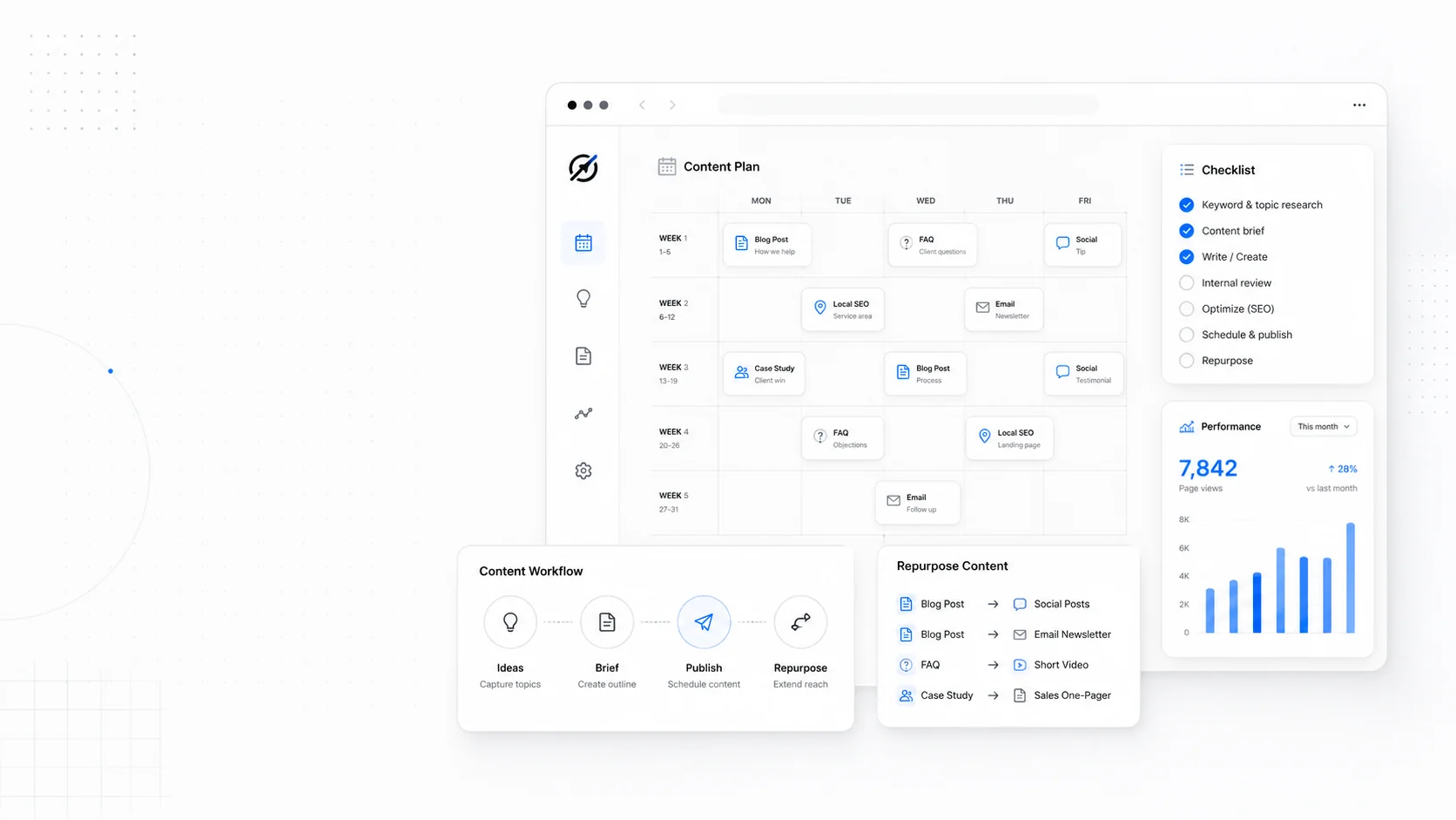
The 2026 Website Content Refresh Playbook: Updating Old Pages Without Breaking SEO
A practical content refresh process for small business websites: how to update stale pages, preserve rankings, improve AI search visibility, and avoid SEO mistakes.
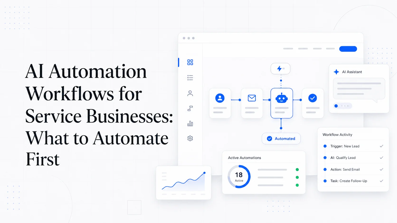
The AI Chat Widget Decision: When It Helps Leads and When It Hurts Trust
AI chat widgets can qualify leads and answer common questions, but they can also slow the site, invent answers, mishandle privacy, and damage trust. Here is how to decide.
Keep reading?
More field notes from building modern websites and software for real businesses.