Image Optimization for the Web: Formats, Sizes, and the CDN Question
A practical guide to image optimization for small business sites in 2026 — AVIF vs WebP vs JPEG, responsive srcset, image CDNs, and Lighthouse impact.
The single biggest reason a small business site is slow is almost always the same: the images are too big, in the wrong format, and shipped to every device at the same size. Everything else — the JavaScript, the third-party tags, the framework choice — usually matters less than a 4 MB hero PNG that nobody asked for.
Images account for the largest share of bytes on the median web page. The HTTP Archive's State of Images report consistently shows images as the heaviest resource type, often by a wide margin. That means the highest-leverage performance work on most sites is also the most boring: pick the right format, ship the right size, and let a sensible delivery layer do the rest.
This post walks through how to make those three decisions in 2026, when AVIF is finally usable everywhere, WebP is the safe default, and the "do I need an image CDN?" question has a real answer.
Why Images Are the First Thing to Fix
Open any neglected small business site in Chrome DevTools and watch the network panel. You will usually see a few patterns repeat:
- A hero image weighing 1-4 MB, shipped at 3000+ pixels wide to a phone displaying it at 375.
- PNGs used for photographs because someone exported from Figma without thinking.
- The same image loaded twice — once as a CSS background, once as an
<img>tag. - No
widthorheightattributes, causing layout shift as each image lands. - Lazy-loading on the hero image, which delays Largest Contentful Paint by seconds.
The fixes are mechanical. None of them require a redesign. Most do not require a developer. But they require someone to actually look.
Format: AVIF, WebP, JPEG, PNG, SVG
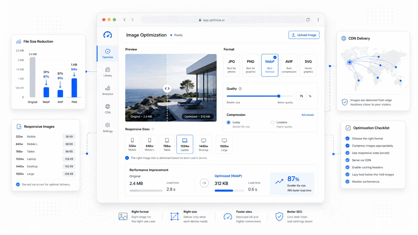
The format question is settled enough in 2026 that you can use a simple decision tree. The point is not to debate codecs; it is to ship the right bytes.
For photographs and complex imagery: Use AVIF as the primary format with a WebP fallback and a JPEG as the final fallback. AVIF typically delivers files 20-50% smaller than WebP at the same perceived quality, and WebP is roughly 25-35% smaller than JPEG. MDN's AVIF reference covers the format details and current encoder support. Browser support is now strong across Chrome, Firefox, Safari, and Edge, with Safari adopting it in version 16.
For UI graphics, logos, and icons: Use SVG. It scales perfectly, compresses well with gzip or brotli, and stays sharp at any density. The MDN SVG documentation covers the basics. Inline critical SVGs to avoid a network request.
For images that need transparency: WebP handles transparency at a fraction of the size of PNG. Use AVIF if you need the smallest possible payload and have the encoder support, otherwise WebP is fine.
When PNG is still the right answer: Screenshots of text, pixel art, and any image where lossy compression visibly degrades the content. PNG is also unavoidable for some legacy email or document workflows.
Avoid GIF for animation. Use a muted, autoplay, looping <video> element with an MP4 or AV1 source. GIFs can be ten times the size of a comparable video for worse quality. Web.dev's guide on replacing GIFs explains the pattern.
The <picture> element makes the format-fallback chain trivial:
<picture>
  <source type="image/avif" srcset="hero.avif">
  <source type="image/webp" srcset="hero.webp">
  <img src="hero.jpg" alt="..." width="1600" height="900">
</picture>
Modern build pipelines and image CDNs handle this automatically, but it is worth understanding what the markup is doing.
Size: Stop Shipping Desktop Images to Phones
Format is the easy half. The harder half is shipping the right size to each device. A 1600px-wide hero is reasonable on a desktop. Sending the same file to a 375px iPhone is wasting roughly 80% of the bytes the user paid for.
This is what srcset and sizes solve. The pattern looks like this:
<img
  src="hero-800.jpg"
  srcset="hero-400.jpg 400w, hero-800.jpg 800w, hero-1200.jpg 1200w, hero-1600.jpg 1600w"
  sizes="(max-width: 768px) 100vw, 50vw"
  alt="..."
  width="1600"
  height="900">
The browser picks the smallest image that satisfies the displayed dimensions and device pixel ratio. MDN's responsive images guide is the most thorough reference. Web.dev's serve-responsive-images post covers the same ground with a focus on Lighthouse scores.
A few rules that hold up in practice:
- Generate at least four width variants for any image used in a hero or above-the-fold context: roughly 400, 800, 1200, and 1600 pixels wide.
- For images that are always small (avatars, thumbnails), one or two variants is usually fine.
- Always specify
widthandheighton the<img>so the browser can reserve space and avoid Cumulative Layout Shift, even when the rendered size differs. - For the LCP image specifically, set
fetchpriority="high"and do not lazy-load it. Web.dev's LCP image guide covers the priority hints in detail. - Lazy-load every image below the fold using
loading="lazy". Browsers handle this natively now and the HTML loading attribute spec is widely supported.
The CDN Question: Do You Actually Need One?
"Do I need an image CDN?" is the question that gets the most overengineered answers. Here is how to think about it honestly.
An image CDN's job is to do three things on demand: transform an original asset into the right format and size for each request, cache that transformation at the edge, and serve it fast from a server geographically close to the user. If you are doing that work manually with a build step, you are essentially running a slower, more rigid version of an image CDN.
You probably do not need a dedicated image CDN if:
- Your site has fewer than a few hundred images.
- Your content is mostly static and rebuilt on deploy.
- You are already on a modern host with edge caching (Vercel, Netlify, Cloudflare Pages, Cloudflare R2 with Workers, etc.) and using its built-in image component.
You probably do want an image CDN if:
- Editors upload images directly through a CMS without a developer in the loop.
- You have hundreds or thousands of images and dozens of size or format variants.
- You serve a global audience and origin latency is hurting LCP outside your home region.
- You need image-level transformations on the fly: cropping, smart focus, format negotiation, watermarking, or DPR-aware delivery.
The credible options as of 2026:
- Cloudinary — the most feature-rich, with strong AI cropping and a generous free tier. Pricing scales with transformation count.
- Imgix — clean URL-based API, transparent pricing, predictable behavior. Popular with engineering teams.
- Vercel's Image Optimization — built into the Next.js
<Image>component, with on-demand resizing at the edge. Zero config if you are already on Vercel. - Cloudflare Images — flat per-image pricing, integrates with the rest of the Cloudflare stack, and works well if you already use their CDN.
- Netlify Image CDN — similar story to Vercel, built into the platform.
The honest answer for most small business sites: if you are on Next.js or any modern framework, the platform's built-in image component covers 90% of what you need. Reach for a third-party image CDN when you have specific transformation requirements or a content team that demands flexibility.
This is the kind of decision we work through with clients during SEO-focused website builds, where image strategy is part of the build, not an afterthought.
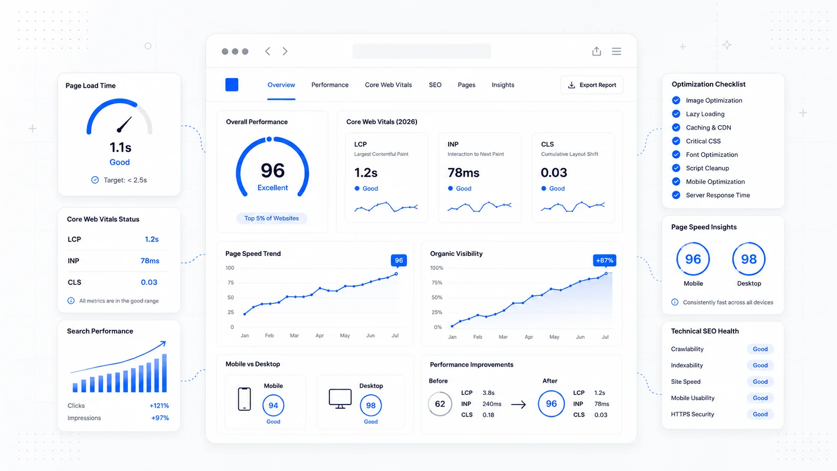
Lighthouse and Core Web Vitals: How Image Work Shows Up
Image optimization moves Lighthouse and Core Web Vitals scores in concrete ways:
- LCP drops sharply when the hero image is correctly sized, in a modern format, and prioritized. This is usually the single largest win.
- CLS drops to near zero when every image has explicit
widthandheightattributes. - Total Blocking Time can improve indirectly because the browser spends less time decoding huge images on the main thread.
- Lighthouse's "Properly size images" and "Serve images in next-gen formats" audits go green, which matters less for ranking than for the team's confidence that the work is done.
Web.dev's image performance guide is the most thorough single resource. For diagnosing a specific page, Chrome DevTools' Performance panel and the Lighthouse panel will both surface the offending images.
A practical rule: if your LCP image is over 200 KB on mobile, you have headroom. If it is over 500 KB, you have a problem. If it is over 1 MB, you have a customer service issue waiting to happen on a slow connection.
A Realistic Workflow for a Small Business Site
If you are running a service business site, you do not need a dedicated DevOps engineer to get image optimization right. You need a workflow you actually follow.
The minimum viable process:
- Source images at the right resolution. A hero rarely needs more than 2000 pixels on the long edge. A blog inline image rarely needs more than 1200.
- Compress before upload. Use Squoosh (Google's open source compressor) or a build-time tool. Drop quality to 75-85 — most viewers will not notice.
- Convert to WebP or AVIF if your CMS or framework supports it natively. If not, use a build step or an image CDN.
- Always add alt text and explicit dimensions. Both for accessibility and for performance.
- Use
<picture>or your framework's image component to serve format fallbacks and responsive variants automatically. - Audit the homepage and top three landing pages every quarter. Image bloat creeps in as content gets added.
For sites where editors add images regularly, an image CDN with automatic format negotiation is usually worth the cost. The alternative is hoping every editor remembers to compress, which they will not.
What to Fix First
Walking into a typical neglected site, the order that delivers the most wins per hour:
- Audit the LCP image on the homepage and the top three landing pages. Resize and convert to AVIF or WebP. Set
fetchpriority="high". - Add
widthandheightattributes to every image to kill CLS. - Strip image metadata (EXIF, color profiles) from photographs. They can add 50-100 KB per image for no visual benefit.
- Add
loading="lazy"to every below-the-fold image. - Replace any GIFs with looping muted videos.
- If editors upload images regularly, plug in an image CDN so the work is automatic.
That is the entire program for most small business sites. It costs an afternoon for a developer, sometimes a few hours of editor training, and it usually delivers a measurable LCP improvement in Search Console within a few weeks.
If you would rather hand it off, image optimization is part of every website care plan we run, and we treat it as a baseline expectation on new builds rather than an upgrade. If you are not sure where your site stands, start a conversation and we will pull a real audit from your live URLs rather than guessing.
Image work is not glamorous, but it is the closest thing to free money in performance engineering. Pick the right format, ship the right size, and stop sending desktop images to phones. The rankings and the conversion rate both follow.
More posts from the blog.

The 2026 Website Content Refresh Playbook: Updating Old Pages Without Breaking SEO
A practical content refresh process for small business websites: how to update stale pages, preserve rankings, improve AI search visibility, and avoid SEO mistakes.
The AI Chat Widget Decision: When It Helps Leads and When It Hurts Trust
AI chat widgets can qualify leads and answer common questions, but they can also slow the site, invent answers, mishandle privacy, and damage trust. Here is how to decide.
Fast Loads, Slow Clicks: Why INP Is the Performance Metric Business Owners Should Care About
A plain-English guide to Interaction to Next Paint (INP): why fast-loading pages can still feel broken, what causes slow clicks, and how to fix the interactions that cost leads.
Keep reading?
More field notes from building modern websites and software for real businesses.