Typography on the Web: The Decisions That Shape Readability
A practical guide to web typography for service businesses: line length, line height, font pairing, fluid type, font loading, and what makes text actually readable.
A surprising number of small business websites have a typography problem they cannot quite name. The text is technically there. The font is technically nice. And reading the page still feels mildly unpleasant — the lines are too long, the gap between them is too tight, the body copy is the same weight as the headings, and on a phone the whole thing turns into a wall of grey.
Typography is the discipline of making written language easy to take in. On the web, where attention is short and devices are unpredictable, the difference between a page that reads easily and a page that reads with effort is almost entirely a series of small decisions that compound. These are the decisions that matter, and the practical defaults that work.
Why Typography Quietly Affects Conversion
Body copy that is hard to read does not produce a single dramatic failure. It produces a slow tax on attention. The visitor's eye works harder, they read less, they retain less, and they leave earlier than they otherwise would. The conversion impact is real but diffuse, which is why typography rarely shows up on a "conversion checklist" and almost always shows up in a careful redesign.
Nielsen Norman Group's eye-tracking research on reading patterns is consistent: visitors scan more than they read on the web, and the scanning pattern is shaped by typographic decisions — heading hierarchy, paragraph length, contrast, line length. Bad typography produces a page that resists scanning. Good typography produces a page that invites it.
This is also where typography meets accessibility. The WCAG 2.2 Understanding document on text covers contrast, resize, and reflow as testable criteria, but the underlying point is the same: text should be easy to read for the broadest range of people, on the broadest range of devices, in the broadest range of conditions.
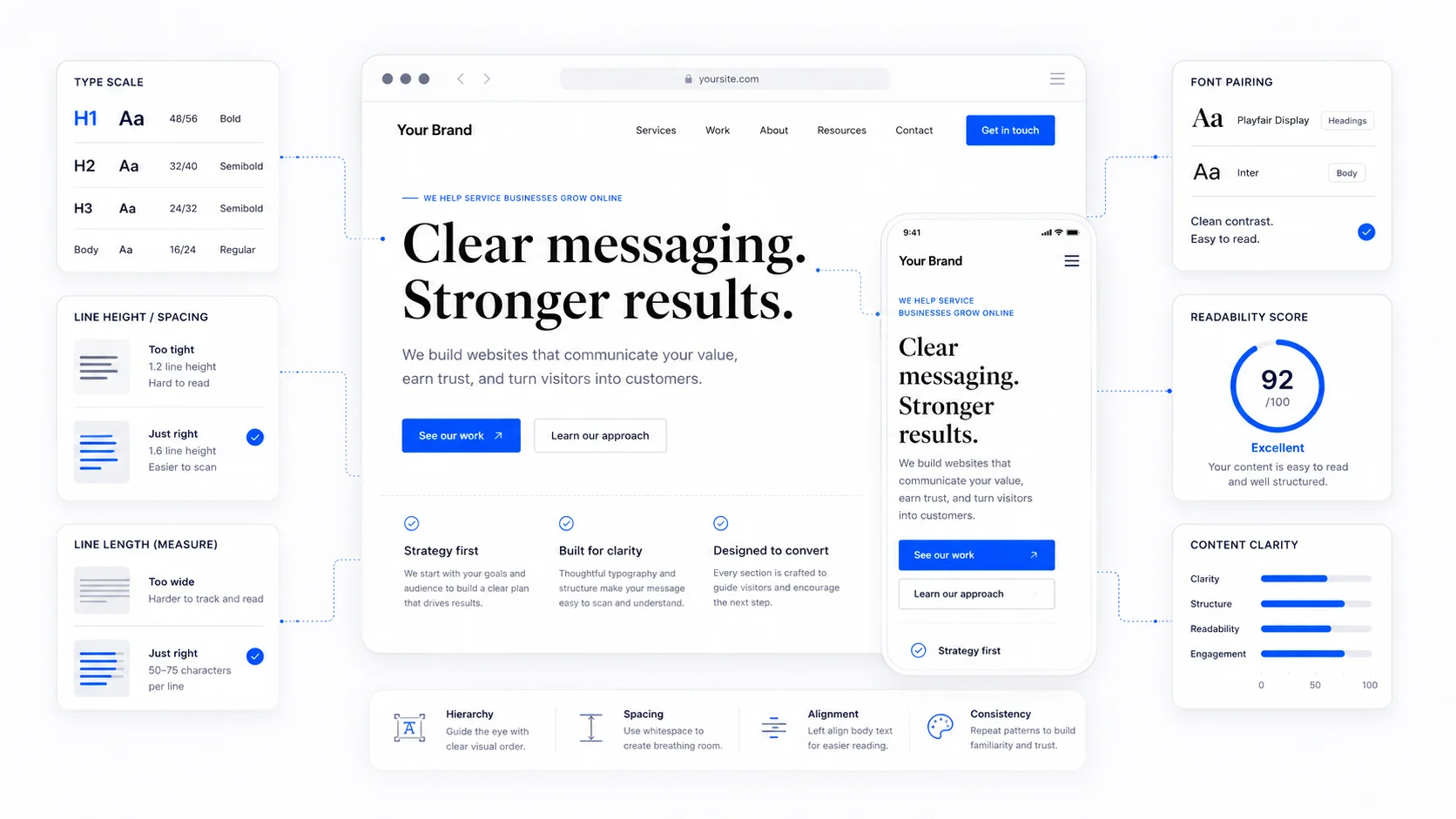
Line Length Is the Most Underrated Decision
The single most common typographic mistake on small business sites is body copy that runs the full width of a desktop screen. On a 1920-pixel monitor, a 16-pixel font running edge to edge produces a line of more than 200 characters. That is roughly twice the comfortable reading length, and it is brutal on the eye.
The classical advice from Robert Bringhurst's Elements of Typographic Style is that a comfortable line is between 45 and 75 characters, with around 66 being a good single-column target. The Baymard Institute's research on readability has reproduced this finding for the web specifically: lines longer than about 75 characters produce measurably worse comprehension and slower reading.
In CSS, the practical implementation is one line:
max-width: 65ch;
The ch unit is roughly the width of the "0" character in the current font, so 65ch lands close to a comfortable line regardless of font choice. Apply it to the article container, the body copy column, the testimonial block — anywhere prose lives. Ignore it for headings, lists, and UI elements where the rule does not apply.
A page that constrains line length looks "narrower" at a glance than one that does not. It also gets read.
Line Height Is the Other Half of Readability
Line length and line height work together. A long line needs more leading to be readable. A short line tolerates less. The interaction is the reason that a single "always use 1.5 line height" rule sometimes works and sometimes does not.
The general defaults that hold up across most body copy:
- Body text: line-height between 1.5 and 1.7. The MDN guidance on the
line-heightproperty and the W3C readability working group recommendations both land in this range. - Headings: line-height between 1.1 and 1.3. Headings are short and bold, and tighter leading reads as more deliberate.
- Captions and metadata: line-height around 1.4, slightly tighter than body copy because the text is smaller and shorter.
The mistake to avoid is setting a single line-height across the whole page. Headings inherit too much leading and look loose. Body copy inherits too little and reads as crammed. Two or three values tuned to the role of each text style produces the calmer rhythm that reads as "professional" without anyone being able to articulate why.
Font Size Should Be Bigger Than You Think
The default body font size on most websites built since 2015 is 16 pixels, which is the browser default for a reason — it is the smallest size most users can read comfortably without leaning forward. On modern phones and high-resolution monitors, 17 or 18 pixels reads more comfortably and looks more contemporary. Smashing Magazine's piece on responsive typography makes the case for larger body sizes in the modern context.
Some practical defaults that hold up well in 2026:
- Body copy: 17 to 19 pixels, comfortable on modern displays.
- Lead paragraphs (the first paragraph of an article): 19 to 22 pixels, slightly larger to invite the reader in.
- Captions and metadata: 14 to 15 pixels, but no smaller; below 14, accessibility becomes a real problem.
- Headings: scaled by a consistent ratio rather than chosen ad-hoc. A typographic scale of 1.25 (the major third) or 1.333 (the perfect fourth) produces a calm, predictable hierarchy. The Type Scale tool is a quick way to preview a scale before committing.
The temptation to set body copy at 14 or 15 pixels because "the design looks tighter" is real. Resist it. The cost is borne by every visitor who has to squint, and on a phone in sunlight, that is more visitors than designers tend to imagine.
Fluid Typography for Modern Screens
The distance between the smallest phone and the largest monitor a site has to support is now wider than the design industry has ever had to deal with. Fixed font sizes get awkward at the extremes — fine on a 14-inch laptop, cramped on a phone, lost in space on a 32-inch desk monitor.
The modern answer is fluid typography. Instead of declaring font-size: 18px and letting it sit at 18 pixels everywhere, you scale it smoothly between two values across a defined viewport range. The CSS function clamp() does this in one declaration:
font-size: clamp(1rem, 0.95rem + 0.4vw, 1.25rem);
That sets the body to scale between 16 pixels at the smallest viewport and 20 pixels at the largest, smoothly. The CSS Tricks reference on clamp() and the MDN documentation on clamp cover the syntax. The Utopia fluid type calculator is a good way to generate a coherent fluid scale across all your text styles in one pass.
The result is type that feels right on a phone, on a laptop, and on a 4K monitor without three sets of media queries. For most service business sites, a fluid body size and a fluid heading scale is the simplest meaningful upgrade we make in any website redesign.
System Fonts vs. Webfonts
The decision between system fonts and webfonts is partly aesthetic and almost entirely about performance.
System fonts — the fonts already installed on the visitor's device — load instantly and add zero kilobytes to the page. The system font stack includes the modern UI fonts (San Francisco on Apple, Segoe UI on Windows, Roboto on Android) and produces a clean, contemporary look without any download. For many service business sites, the right answer is "use the system font stack and stop thinking about it." Stripe, GitHub, and Medium have all run with system-font body copy at various points without anyone calling the design lazy.
Webfonts — fonts downloaded from the server (or from a service like Google Fonts) — offer brand expression and consistent appearance across devices, at the cost of bytes and load time. They are not bad. They are a trade-off. The web.dev guide on font best practices is the canonical reference for doing them well.
If you use webfonts:
- Self-host them rather than loading from a third-party CDN. Self-hosting is faster, more private (no third-party request), and avoids the legal issues of third-party font services in jurisdictions with strict privacy laws.
- Limit the number of weights and styles. A typical site needs at most two weights of one font, plus maybe two weights of a heading font. Loading nine weights "just in case" is the most common font performance mistake.
- Use
font-display: swapso the page renders with a fallback font immediately and swaps in the webfont when it loads. This avoids the "flash of invisible text" (FOIT) that punishes slow connections. The MDN reference onfont-displaycovers the variants. - Use
preloadfor the critical font file so the browser starts the download in parallel with the rest of the page. - Subset the font to the characters you actually use. A typical site needs Latin, maybe Latin Extended; loading the full Cyrillic-Greek-Vietnamese set is wasted bandwidth.
- Use variable fonts where possible. A single variable font file can replace several weight-and-style files at a fraction of the total size. The CSS Tricks introduction to variable fonts is a friendly starting point.
For a service business site, the realistic font budget is around 100KB of total font data. If your fonts add 400KB to the page, the typography is making the site slower than it needs to be, and the Core Web Vitals impact is real.
Font Pairing Without Drama
Font pairing is one of those topics that designers can talk about for hours and small business owners can spend a weekend on. The honest summary is that you do not need a complicated pairing. One good font, used at multiple weights, will outperform a clever pairing executed without conviction.
If you do pair, the dependable patterns are:
- One sans-serif, one weight, varied size. This is the most common modern pattern. Inter, Söhne, IBM Plex Sans, or the system stack at multiple sizes and weights. Calm, contemporary, fast.
- Sans-serif headings + serif body. Headings in something like Inter or Söhne, body in something like Source Serif, Lora, or Charter. Reads as editorial. Works well for content-heavy sites.
- Serif headings + sans-serif body. Inverse of the above. Reads as classical and professional. Works well for legal, financial, and high-trust services.
The Fonts in Use archive is a good place to study real-world pairings. The trap to avoid is pairing two fonts that are too similar (two humanist sans-serifs) or too close in weight (no contrast). The pairing should look intentional at a glance.
Color Contrast Is Part of Typography
The typeface, size, and weight are only half of readability. The contrast between text and background does the other half. Light grey text on white might look "elegant" in a Figma file, and it is unreadable on a phone in sunlight.
WCAG 2.2 requires a contrast ratio of at least 4.5:1 for normal body text and 3:1 for large text (18pt or 14pt bold) and UI components. The WebAIM contrast checker takes two hex codes and tells you the ratio in seconds. The APCA method is the next-generation calculation that better matches human perception, and is worth knowing about for the future.
Practical defaults:
- Body text: dark grey on white, around #222 on #ffffff, comfortably above the 4.5:1 minimum.
- Secondary text: a slightly lighter grey, but not below the contrast minimum. #555 on white passes; #999 does not.
- Links: a colour distinct from body text, not relying on colour alone (underline or other affordance), passing contrast requirements both for resting and hover states.
We covered the broader accessibility implications in our WCAG 2.2 guide. For typography specifically, the rule is short: if your designer hands you "elegant" light-grey body copy, send it back.
Avoid the Common Typographic Failures
A handful of mistakes show up on almost every small business site we audit, and all of them are quick to fix once seen.
All-caps body copy. Capitals are harder to read than mixed case because the word shapes are flatter and less distinctive. Fine for short labels and short headings; punishment for sentences. The research summarised by Smashing Magazine is well worn but still correct.
Justified body text on the web. Justified text on the web produces ugly word spacing because browsers do not hyphenate well. Stick with left-aligned (or right-aligned for RTL languages). The W3C i18n notes on text alignment are a good primer.
Italic for entire paragraphs. Italic is for emphasis or for proper conventions (book titles). An entire paragraph in italics is harder to read than the same paragraph in roman.
Centered body copy. Centered text is fine for short headings and isolated quotes. For body paragraphs, the ragged left edge breaks the eye's anchoring and makes scanning slower.
Underlined non-link text. Underlines mean "link" on the web. Using them for emphasis confuses visitors. Use bold or italic for emphasis; reserve underline for links.
Tiny captions, footers, and disclaimers. Anything you write in 11-pixel grey is something you have decided not to be read. If it is important enough to be on the page, it is important enough to be at 14 pixels minimum, with passing contrast.
A Practical Action List
If your typography needs work, the first pass is short and almost entirely free of design taste:
- Constrain body copy to about 65 characters per line with
max-width: 65ch. - Set body line-height between 1.5 and 1.7, headings between 1.1 and 1.3.
- Bump body font size to 17 or 18 pixels and check that all text passes WCAG 2.2 AA contrast.
- Move to fluid type using
clamp()so sizes scale smoothly between phones and large displays. - Audit your webfont loading: self-host, preload critical files, use
font-display: swap, drop unused weights, and consider variable fonts. - Replace centred or justified body copy with left-aligned blocks.
- Test the result on a real mid-range Android phone, in sunlight, on cellular. If it reads easily there, it reads easily everywhere.
Typography rewards patience. Most of the changes above take an afternoon, cost nothing, and quietly raise the perceived quality of the entire site. If you want help auditing the typographic baseline of your site as part of broader conversion-focused design work, get in touch. The change tends to be one of the ones clients notice in week one and stop noticing in week three, which is usually how you can tell it was the right change.
More posts from the blog.

The AI Chat Widget Decision: When It Helps Leads and When It Hurts Trust
AI chat widgets can qualify leads and answer common questions, but they can also slow the site, invent answers, mishandle privacy, and damage trust. Here is how to decide.
Fast Loads, Slow Clicks: Why INP Is the Performance Metric Business Owners Should Care About
A plain-English guide to Interaction to Next Paint (INP): why fast-loading pages can still feel broken, what causes slow clicks, and how to fix the interactions that cost leads.
Accessibility Overlays Are Not a Compliance Plan: What Business Owners Should Do Instead
Accessibility overlay widgets promise one-line compliance, but real accessibility comes from fixing the website itself: markup, contrast, keyboard support, forms, content, and testing.
Keep reading?
More field notes from building modern websites and software for real businesses.