
Website Accessibility (WCAG 2.2): A Practical Guide for Business Owners
A practical WCAG 2.2 accessibility guide for small business owners: legal landscape, color contrast, keyboard nav, alt text, and what cheap fixes really buy you.
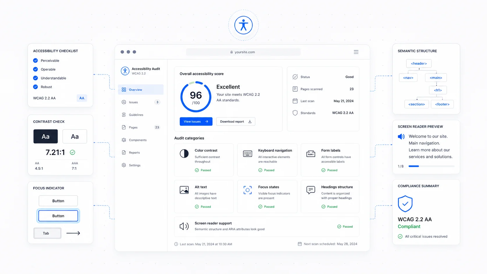
Most small business websites are not accessible. Not because anyone designed them to exclude people, but because accessibility was never on the brief, the agency that built the site never raised it, and nothing visibly broke when it shipped. The result is a site that is usable for most visitors and silently unusable for a meaningful minority — people using screen readers, people on keyboards, people with low vision, people on glare-bright phones in direct sunlight, people whose hands shake.
The legal landscape has changed enough in the last few years that "we never thought about it" is no longer a viable answer. Accessibility lawsuits in the US are at record levels, the European Accessibility Act is now in force, and search engines like Google increasingly use accessibility signals as quality signals. The good news: most of what matters can be fixed without a rebuild. The bad news: the cheap fixes that promise full compliance from a single line of JavaScript do not work and have started to attract their own lawsuits.
This is the practical guide for business owners — what WCAG actually requires, what the law actually says, and where to spend your money.
What WCAG 2.2 Is and Why It Is the Standard
The Web Content Accessibility Guidelines (WCAG) are written by the World Wide Web Consortium and have been the global benchmark for accessible web content since 1999. WCAG 2.2 was published in October 2023 as the current stable version. WCAG 3 is in draft and not yet a compliance target.
The guidelines are organised under four principles, often abbreviated as POUR: content must be Perceivable, Operable, Understandable, and Robust. Within each principle there are success criteria graded at three levels — A (the absolute minimum), AA (the practical target), and AAA (which is rarely required end-to-end and sometimes impossible for certain content types).
For business websites, the working target is WCAG 2.2 Level AA. That is the bar referenced by most legal frameworks, the bar most public-sector procurement requires, and the bar that translates into the broadest improvement for real users. Level A on its own is too low; Level AAA is unrealistic as a sweeping requirement.
The full WCAG 2.2 specification is dense, but the W3C's quick reference (How to Meet WCAG) is a much friendlier way to read it, with filters for level, technology, and tag.
The Legal Landscape, Briefly
The legal picture varies by jurisdiction, but the direction is consistent: accessibility is increasingly enforceable.
United States. The Americans with Disabilities Act has been interpreted to cover commercial websites by the Department of Justice, which published web accessibility guidance in 2022 and a final rule in 2024 requiring state and local governments to meet WCAG 2.1 AA. Private business cases continue to use WCAG as the de facto standard. UsableNet's yearly accessibility lawsuit reports consistently show thousands of ADA Title III website lawsuits per year, with retail and service businesses among the most common targets.
European Union. The European Accessibility Act became enforceable in June 2025 and applies to a wide range of products and services sold to consumers in the EU, including e-commerce, banking, transport, and many digital services. The expected technical standard is the EN 301 549 harmonised standard, which incorporates WCAG.
United Kingdom. The Equality Act 2010 has long required reasonable adjustments for disabled customers, with public sector bodies bound by the Public Sector Bodies Accessibility Regulations.
Canada. The Accessible Canada Act and provincial laws like the AODA in Ontario set similar expectations for federally regulated and Ontario-based organisations.
The point is not that every small business will be sued tomorrow. The point is that "we never thought about it" stopped being a defensible posture some time ago, and any redesign or new build should be treated as an opportunity to get the basics right.
The Cheap Fix That Does Not Work
Before going further, a warning: a category of products markets itself as a "single line of code" that makes a site accessible. They install an overlay widget that promises to fix contrast, add alt text, and adjust the experience for users with disabilities.
These overlays do not work. The accessibility community has documented their failures at length, most clearly in The Overlay Fact Sheet, an open letter signed by hundreds of accessibility specialists. Real screen reader users frequently report that overlays make sites harder to use, not easier. Several US lawsuits have been filed against businesses whose only "remediation" was an overlay, and courts have not been impressed.
If you are evaluating an accessibility tool, the right question is not "does it have a widget?" but "does it surface real issues in your code so they can be fixed at the source?" Audit tools like axe DevTools, WAVE, Lighthouse, and Pa11y all do that, none of them charge per-pageview, and none of them claim to make a site compliant by themselves.
The Six Things Most Small Business Sites Get Wrong
These are the issues that show up on almost every site we audit, in rough order of impact.
1. Color Contrast
WCAG AA requires a contrast ratio of at least 4.5:1 for normal text and 3:1 for large text and UI components. Most brand colour palettes were designed before this was thought about, and the result is light grey text on white, pale buttons with white labels, or hover states that disappear on touch devices.
The fix is one of the most measurable in accessibility work. The WebAIM contrast checker takes two hex codes and gives you a ratio in seconds. The APCA (Advanced Perceptual Contrast Algorithm) is the next-generation method being incorporated into WCAG 3, and is worth knowing about, but the WCAG 2 ratio is still the test that matters today.
A practical rule for designers: if a colour combination passes 4.5:1 on a calibrated monitor in a dark office, it will probably still pass on a phone screen in sunlight. If it does not pass in the office, it will fail in the field.
2. Keyboard Navigation
Every interactive element on a site — every link, button, input, dropdown, modal — must be reachable and operable using only the keyboard. The order should follow the visual order, focus should be clearly visible, and there must be no keyboard traps where focus gets stuck.
The test is simple. Open your site, click in the address bar, and press Tab. Tab through every page. Can you reach every interactive element? Can you see where focus is at all times? Can you operate the menu, the modal, the form, the cookie banner without ever touching the mouse?
A common failure: a designer removed the default focus ring because it "looked ugly" and never replaced it. The replacement does not have to be the browser default — it can be a brand-coloured outline, a subtle box shadow, anything visible — but something must be there. The WCAG 2.4.7 success criterion on focus visibility is one of the most frequently failed criteria in audits.
WCAG 2.2 added new criteria specifically about focus, including 2.4.11 Focus Not Obscured, which requires that the focused element not be hidden by sticky headers, cookie banners, or chat widgets. Worth checking on any site with a sticky nav.
3. Alt Text on Images
Alt text — the alt attribute on <img> tags — is read aloud by screen readers and shown when an image fails to load. It is also one of the lowest-effort accessibility wins, and one of the most consistently missed.
The rules, drawn from the W3C alt text decision tree, are simpler than they look:
- Decorative images (background patterns, generic stock decoration) get an empty alt:
alt="". Not missing — empty. - Functional images (an icon that is also a button) get an alt that describes the function, not the picture. A magnifying glass icon used for search gets
alt="Search", notalt="Magnifying glass". - Informative images get an alt that conveys the same information the image conveys. A chart should describe the trend, not the axes.
- Images of text should be replaced with real text whenever possible.
A common mistake is to write alt text like a librarian. "Photograph of three smiling people in business attire standing in front of a glass building." That is description for description's sake. If the image is decorative, it should not have alt text at all. If it is informative, the alt should say what the image means in context.
4. Form Labels
Every form input must have a real, programmatically associated label. The WebAIM forms guide covers this in depth. Placeholder text is not a label. A floating label that disappears when the user starts typing is not a label either, unless it is also implemented as a real <label> element.
The cleanest pattern is the visible <label> element, positioned above the input, associated via for and id. It works for sighted users, screen reader users, voice-control users, and users with cognitive load issues who appreciate not having to remember what each field was supposed to be.
We covered this in more depth in our form design guide.
5. Heading Structure
Headings are how screen reader users navigate. They jump from H1 to H2 to H3 the way a sighted user scans a page. If your headings are decorative — a marketing slogan styled as <h1>, body copy turned into <h2> because it looked good — the page becomes incoherent through a screen reader.
The rules are short:
- One
<h1>per page that names the page. <h2>for the major sections.<h3>for sub-sections, in order, without skipping levels.- Headings used for structure, not for visual styling. If you want big text, use CSS.
WebAIM's survey of screen reader users consistently shows that headings are the most common navigation method, ahead of links, search, and landmarks. A site with bad heading structure is genuinely harder to use, not just abstractly non-compliant.
6. Link and Button Text
Links and buttons should make sense out of context. "Click here," "Read more," and "Learn more" are useless when read aloud as a list of links by a screen reader.
The fix is to make the link text describe its destination. "Read our 2026 pricing guide" beats "Click here." "Book a free consultation" beats "Learn more." This is also good for SEO and good for sighted users skimming the page, which is why it is one of the easier accessibility recommendations to sell.
The WCAG 2.4.4 success criterion on link purpose covers this formally; the GOV.UK guidance on writing links is the friendlier read.
What WCAG 2.2 Added Over 2.1
If you are coming from WCAG 2.1, the practical additions in 2.2 are mostly about touch interfaces, focus, and authentication.
- 2.4.11 Focus Not Obscured (Minimum). Sticky elements must not hide the focused control.
- 2.5.7 Dragging Movements. Any function that requires a drag must also be available without dragging (e.g., a slider should also be operable by keyboard or with simple taps).
- 2.5.8 Target Size (Minimum). Touch targets should be at least 24x24 CSS pixels, with exceptions. The Apple Human Interface Guidelines and Material Design touch target guidance recommend even larger (44px and 48dp respectively).
- 3.2.6 Consistent Help. Help mechanisms (contact, FAQ, chat) should be in the same place across pages.
- 3.3.7 Redundant Entry. Don't make the user re-enter information they have already provided in the same flow.
- 3.3.8 Accessible Authentication (Minimum). Don't require a cognitive function test for login (no maths puzzles, no transcribing distorted CAPTCHAs without an alternative).
The full 2.2 update is short and worth reading if you are commissioning a new build.
Cheap Fixes vs. a Full Audit
Where should a small business spend the money? It depends on where you are.
Cheap fixes that are worth doing this week. Run Lighthouse or WAVE on your top five pages. Fix the contrast errors. Add alt text. Make sure every form field has a label. Tab through your site with the keyboard and make sure focus is visible. These will get you a long way and cost almost nothing.
A full audit is worth doing when you are about to redesign, when you are subject to specific legal requirements (procurement, public sector, EAA-covered services), when you have actual users with disabilities and want to do right by them, or when you have grown to a size where a complaint would be material. A real audit involves both automated tools and manual testing by accessibility specialists, often including users of assistive tech.
Automated tools, even very good ones, only catch a fraction of issues. Deque's research, summarised on the axe-core project page, suggests automated testing finds roughly 30 to 40 percent of accessibility defects. The rest require human review. That is why the cheap fixes are valuable but not sufficient as a long-term answer.
For most small businesses, the right path is to bake accessibility into ongoing website care and into any new build, treat it as a quality bar rather than a project, and revisit it whenever the site changes meaningfully. We treat it that way on every SEO-focused website build and every redesign — accessibility, performance, and SEO are the same conversation about the same underlying quality of the page.
A Practical Action List
If you want a starting point that you can act on this week:
- Run Lighthouse, axe DevTools, or WAVE on your top five pages and fix the obvious errors first (contrast, missing labels, missing alt text).
- Tab through your site without a mouse. Confirm focus is always visible and you can reach every interactive element.
- Replace any "click here" or "read more" links with descriptive text.
- Check your forms have real
<label>elements, visible and associated with their inputs. - Add a public accessibility statement to your site that names your target (WCAG 2.2 AA) and gives a contact for accessibility issues.
- If you have an overlay widget on your site, remove it and start fixing the underlying problems.
- For any new build or redesign, write WCAG 2.2 AA into the brief.
Accessibility done well is invisible. The site simply works for everyone, and the team stops getting the occasional embarrassed email from a customer who could not complete a form. If you want a quick audit pass on your existing site, get in touch — most small business sites can be brought into a defensible position with a focused round of work, no rebuild required.
More posts from the blog.
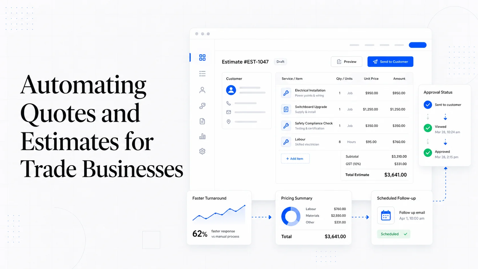
From Contact Form to CRM: The Minimum Lead Pipeline Every Service Business Should Automate
A practical lead pipeline for service businesses: connect forms, calls, email, CRM records, reminders, follow-ups, and reporting so good leads stop disappearing.
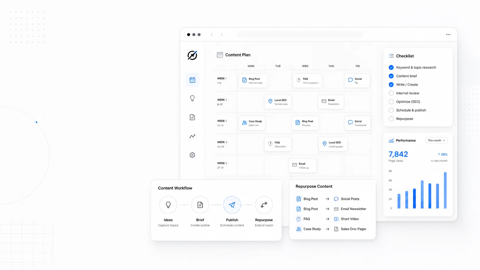
The 2026 Website Content Refresh Playbook: Updating Old Pages Without Breaking SEO
A practical content refresh process for small business websites: how to update stale pages, preserve rankings, improve AI search visibility, and avoid SEO mistakes.
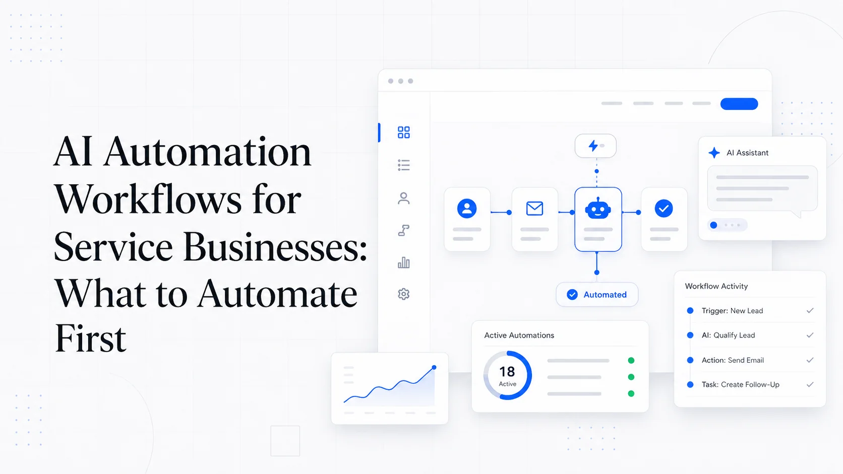
The AI Chat Widget Decision: When It Helps Leads and When It Hurts Trust
AI chat widgets can qualify leads and answer common questions, but they can also slow the site, invent answers, mishandle privacy, and damage trust. Here is how to decide.
Keep reading?
More field notes from building modern websites and software for real businesses.