
Is Your Website Ready for AI Agents? Booking, Quotes, Forms, and Service Pages in 2026
AI agents will expose weak website workflows. Here is how service businesses can make booking, quotes, forms, service pages, and contact paths ready for human and AI-assisted buyers.
Most websites are built for a person clicking around with a vague sense of what they need. The next version of the web also has to work for a person using an AI assistant.
That does not mean your website needs a science-fiction interface. It means your business information, forms, booking flows, pricing guidance, and service pages need to be clear enough that an assistant can help a buyer take the next step without guessing.
If your website already confuses humans, AI agents will not fix it. They will expose the confusion faster.
What "AI Agent Ready" Actually Means
An AI agent is software that can take steps on behalf of a user: compare options, summarize pages, fill forms, schedule appointments, request quotes, or gather information before a buying decision.
For a service business, the near-term version is simple:
- A customer asks an assistant to find providers.
- The assistant reads service pages.
- It compares availability, location, pricing clues, reviews, and next steps.
- It may open a booking page or contact form.
- It may pre-fill information from the user's request.
- It may help the user ask better questions.
This only works if your website exposes clear, stable information and predictable workflows.
Agent readiness is not about building your own agent first. It is about making your website understandable and operable by the agents customers are already starting to use.
The Pages Need to Be Specific
An AI assistant cannot confidently recommend a service it cannot understand.
Your service pages should clearly state:
- What the service is.
- Who it is for.
- What problems it solves.
- What locations you serve.
- What is included.
- What is not included.
- What the process looks like.
- What affects cost.
- What information you need from the customer.
- What the next step is.
This helps people too. The more precise the page, the less time your team spends answering basic fit questions.
Example:
"We build custom portals" is vague.
"We build client portals for service businesses that need customers to upload files, view invoices, submit requests, track project status, and message the team without sending everything through email" is useful.
The second version gives an assistant enough information to decide whether the service matches the user's request.
Booking Should Not Be a Maze
Booking flows often fail because they were added after the site was built. A button goes to a calendar tool, the calendar asks for too many fields, the timezone is unclear, the confirmation email is generic, and the business still needs to call afterward to collect missing details.
For AI-assisted buyers, booking should be boring and predictable.
A strong booking flow has:
- One primary booking CTA on relevant service pages.
- Clear appointment types.
- Clear duration.
- Clear timezone.
- Plain language about who the meeting is for.
- Required fields limited to what is needed.
- A confirmation page with next steps.
- A confirmation email with rescheduling instructions.
- CRM or inbox routing behind the scenes.
Avoid mystery labels like "Discovery Session" if the buyer does not know what that means. "Book a 20-minute website audit call" is clearer.
The assistant should be able to tell the user what they are booking and what happens next.
Quote Forms Need Better Questions
Most quote forms are bad in one of two ways:
- Too short: "Name, email, message" gives the business no useful context.
- Too long: twenty fields scare away qualified buyers.
The right form asks for enough information to route and qualify the request without turning the form into homework.
For a service business, useful fields often include:
- Contact details.
- Service needed.
- Location or service area.
- Timeline.
- Budget range or project size.
- Current website or relevant link.
- Short description of the problem.
- Preferred contact method.
Use conditional logic when possible. A website redesign lead and a maintenance lead should not have to answer identical questions.
The goal is not only to help your staff. It is to make the form understandable to an assistant that may help the buyer submit the request.
Field labels should be explicit:
- "Website URL" beats "Link."
- "What service do you need?" beats "Project type."
- "When do you want to start?" beats "Timeline."
- "What is the main problem you want fixed?" beats "Tell us more."
Pricing Guidance Matters More Than Ever
Many service businesses avoid pricing because every project is different. That is understandable. It is also frustrating for buyers and unhelpful for AI-assisted comparison.
You do not need exact prices for everything. You do need guidance.
Useful pricing content includes:
- Starting prices.
- Typical ranges.
- What changes the price.
- What is included.
- What is not included.
- Examples of small, medium, and large projects.
- Maintenance or ongoing costs.
- Payment structure.
Example:
"Website redesign projects usually start around $6,000. Smaller landing-page projects may cost less; larger rebuilds with custom integrations, copywriting, and migration planning can run $15,000 or more."
That does not lock you into a quote. It helps a buyer self-qualify. It helps assistants compare fit. It reduces calls from people expecting a $500 project.
We covered broader pricing in How Much Should a Website Cost in 2026?, but the agent-readiness point is this: hidden pricing creates friction.
Contact Information Should Be Machine-Readable
Your contact details should be visible in text, not only inside an image or decorative component.
Make sure the site clearly exposes:
- Business name.
- Phone number.
- Email or contact form.
- Service area.
- Hours or response expectations.
- Physical address if relevant.
- Appointment link.
- Support link for existing clients.
Use standard links:
<a href="tel:+15551234567">Call</a>
<a href="mailto:hello@example.com">Email</a>
This is basic accessibility, mobile UX, and machine readability at the same time.
Forms Need Real Error Handling
If an agent or user submits a form and something fails, the site needs to explain what happened.
Bad form errors:
- "Invalid."
- "Something went wrong."
- Red border with no text.
- Error disappears before it can be read.
- Submission fails silently.
Good form errors:
- Identify the field.
- Explain the fix.
- Preserve entered data.
- Move focus to the error summary when appropriate.
- Confirm successful submission.
- Send a backup notification to the business.
This matters because a broken form is not just a technical bug. It is a lost lead. If AI-assisted traffic becomes more qualified, every failed submission gets more expensive.
Our form design guide covers the human side. The agent-ready version adds one more rule: make the form predictable enough that software can help without inventing meaning.
Use Integrations Behind the Scenes
Agent-ready does not mean the agent needs direct access to your CRM. It means the website workflow should not end in a messy inbox.
At minimum:
- Form submission creates a CRM lead or tracked record.
- The business receives a notification.
- The customer receives confirmation.
- Source and landing page are captured.
- Follow-up task is created.
- Spam is filtered.
- Failed submissions are logged.
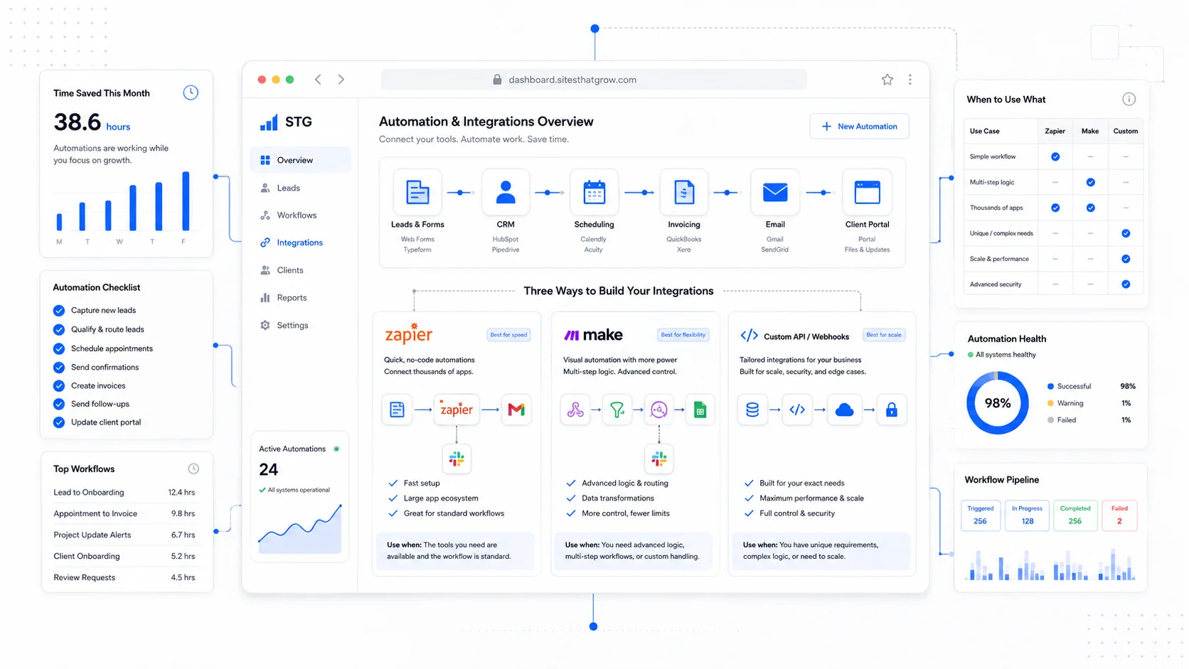
For many small businesses, Zapier, Make, HubSpot, Airtable, or a lightweight CRM is enough. For more complex workflows, custom integration may be cleaner.
We covered the build-versus-automation question in Website Integrations That Actually Save Time. The same principle applies here: automate the handoff where leads are currently dropped.
The AI Agent Readiness Checklist
Review your site with this checklist:
- Each major service has its own clear page.
- Service pages say who the service is for and not for.
- Pricing ranges or price drivers are visible.
- Locations and service areas are explicit.
- Reviews and proof are tied to relevant services.
- Booking buttons describe the appointment.
- Quote forms ask useful but limited questions.
- Contact details are visible as text.
- Forms have accessible labels and clear errors.
- Confirmation pages explain next steps.
- Leads route into a CRM or tracked process.
- Important pages are crawlable.
- Business details are consistent across profiles.
If you pass this checklist, you are not only ready for AI agents. You are ready for better human buyers.
The Practical Takeaway
AI agents will not make unclear businesses clear. They will reward the businesses that publish clear information and offer clean next steps.
If your site says what you do, who you serve, what it costs, how to start, and what happens after the form is submitted, you are ahead of most competitors.
The agent-ready website is not a gimmick. It is a website with less ambiguity.
That is good for search. Good for accessibility. Good for conversion. Good for your team. And increasingly, good for the AI-assisted customer who wants to move from research to action without fighting your interface.
More posts from the blog.
From Contact Form to CRM: The Minimum Lead Pipeline Every Service Business Should Automate
A practical lead pipeline for service businesses: connect forms, calls, email, CRM records, reminders, follow-ups, and reporting so good leads stop disappearing.
The 2026 Website Content Refresh Playbook: Updating Old Pages Without Breaking SEO
A practical content refresh process for small business websites: how to update stale pages, preserve rankings, improve AI search visibility, and avoid SEO mistakes.
The AI Chat Widget Decision: When It Helps Leads and When It Hurts Trust
AI chat widgets can qualify leads and answer common questions, but they can also slow the site, invent answers, mishandle privacy, and damage trust. Here is how to decide.
Keep reading?
More field notes from building modern websites and software for real businesses.