Microcopy: The Tiny Words That Decide Whether People Buy
A practical guide to microcopy for service business websites: button labels, form helpers, error messages, empty states, and confirmations that actually convert.
The label on your form button. The little grey hint under the email field. The error message that appears when someone mistypes a postcode. The "thank you" page after a quote request. The empty state on the dashboard when a new user logs in for the first time.
These are microcopy. They are the words no one writes a brief for, no one signs off on, and no one tests against alternatives. They are also, line for line, the highest-converting words on most websites — because they appear at the exact moments where the visitor has to decide whether to keep going or give up.
This is the practical guide to writing microcopy that earns its keep. Not "tone of voice." Not "brand language." The actual words that sit on the buttons, in the form helpers, on the error messages, and in the confirmation pages that decide whether someone becomes a customer.
Why Microcopy Is Disproportionately Powerful
Microcopy works on a simple principle: when the visitor's attention is at its peak — they are hovering over a button, they are confused by a form field, they have just hit an error — every word on the screen does more work than usual. A vague label at that moment costs more than a vague paragraph elsewhere.
Kinneret Yifrah's book Microcopy: The Complete Guide is the canonical reference and worth the read. The shorter version: microcopy is the place where UX writing earns its salary, because you can measurably move conversion by changing four words on a button without touching anything else on the page. The classic Unbounce case study where "Start your free 30 day trial" beat "Start my free 30 day trial" is older than most CRO tooling, and the principle still holds: small, deliberate word choices compound.
For a small service business, this is good news. Microcopy improvements are cheap, fast, and do not require a redesign. They are the easiest "next round of work" to commission after the structural design decisions are settled.
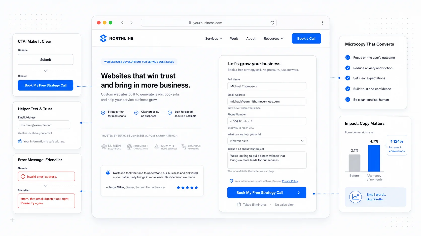
Button Labels: Describe the Result, Not the Mechanic
The most common microcopy mistake on small business sites is the generic button label. "Submit." "Send." "Continue." "Click here." These are all about the mechanic of the click, not the result of it.
The fix is to describe what the visitor gets when they click. Not what they do.
A few before-and-after examples that translate well to service businesses:
- "Submit" becomes "Get My Free Quote" or "Send My Request."
- "Continue" becomes "See Available Times" or "Review My Order."
- "Sign Up" becomes "Start My Free Trial" or "Create My Account."
- "Learn More" becomes the literal next step — "See Pricing," "Read the Case Study," "View the Service Page."
- "Subscribe" becomes "Send Me the Weekly Digest."
The pattern is two-fold. First, the verb should be the result. Second, possessive language ("My" instead of "Your") often outperforms the formal alternative because it puts the visitor inside the outcome rather than describing it from outside. The Unbounce study above is the classic citation; CXL's overview of CTA testing is a longer summary of the pattern.
A second rule: button labels should not be questions. "Want to learn more?" on a button is awkward; "See How It Works" is direct. The button is the answer, not the question.
A third rule: button labels should be short, but not at the cost of clarity. "Get a Quote" beats "Click Here to Submit Your Quote Request Form." The same phrase compressed too far ("Quote") loses the meaning. Two to five words is the practical range.
Form Helpers: Reduce Anxiety, Set Expectations
The little grey text under or beside a form field has a small but specific job: tell the visitor exactly what to enter, why you need it, and what will happen with it.
The patterns that work:
- For an email field next to a "What happens next" section: "We'll send your quote here within one business day."
- For a phone field on a contact form: "Optional. We'll only call if email isn't enough."
- For a project description: "A few sentences is fine — we'll ask for more if we need it."
- For an address field on a service intake: "We use this to confirm you're in our service area."
- For a budget range: "A rough number helps us tailor the quote. Not binding."
The principle is the same in every case: explain the why, not just the what. Visitors hesitate at form fields when they cannot tell why the information is being asked for, especially for fields that feel personal (phone, address, budget). A one-line helper that names the reason removes the hesitation.
Mailchimp's content style guide and GOV.UK's content design manual are the two best free references for what good form helpers read like in practice. Both are worth bookmarking.
The opposite mistake is helper text that lectures or scolds. "Please enter a valid email address" is unnecessary — that is what error messages are for. Helpers should appear before the user types, not after. They are setup, not correction.
We covered the broader form architecture in our form best practices post; microcopy is the layer on top.
Error Messages: Help, Don't Blame
Error messages are the moment of truth in microcopy. The visitor has just made a mistake — usually a small one, usually under time pressure — and the words they read in the next half-second decide whether they recover and continue or give up and leave.
The default error messages from form libraries are uniformly bad. "Invalid input." "This field is required." "Please enter a valid email address." None of them tell the visitor what to do next.
Better patterns, drawn from GOV.UK's design system error message guidance:
- Be specific about what went wrong. "Enter a postal code in the format A1A 1A1, like T2P 0V8" beats "Invalid postal code."
- Tell the visitor what to do. "Enter an email address in the format name@example.com" beats "Email is invalid."
- Use the user's words. If the field is labelled "Phone number," the error says "phone number," not "telephone."
- Stay calm. The error is a signal, not a punishment. Avoid exclamation marks and the word "error" itself when possible.
- Offer a recovery path when one is known. "We can't find that account. Did you mean to sign up?" beats "Invalid login."
The Nielsen Norman Group's guidelines for error messages is the longest-standing reference here, and most of its recommendations from the early 2000s still hold. The medium has changed; human reactions to being told they did something wrong have not.
A small but worthwhile practice: read your error messages out loud. If you would not say the sentence to a customer in person without it sounding harsh, do not put it on the screen.
Empty States: The Most Wasted Opportunity in Product UX
If your site or product has a logged-in area, the empty state — the screen a new user sees the first time they log in, before they have any data — is one of the highest-leverage microcopy opportunities you have. Nine times out of ten it says "No results" or "Nothing here yet" and that is the entire treatment.
A good empty state does three things at once:
- Names what would normally be there.
- Explains why it is empty right now.
- Tells the user the very next thing they should do.
For example, a project list empty state: "You haven't created any projects yet. Projects are how you track work — start one and we'll save your progress as you go." Followed by a single primary button: "Create My First Project."
The pattern works for every empty state on every product surface:
- Empty inbox: "You're all caught up. New messages will appear here."
- Empty client list (for an internal tool): "No clients yet. Add one to start sending invoices."
- Empty search result: "We couldn't find any matches for [query]. Try a different word, or browse all services."
- Empty cart: "Your cart's empty. See our most-booked services to get started."
The Smashing Magazine guide to empty states collects examples across SaaS, e-commerce, and content products. The same patterns apply to bespoke custom software we build for service businesses — the internal tools that staff use every day are full of empty states that quietly teach the team how the product works.
Confirmation Pages and Emails: Manage the Wait
The confirmation page after a form submission is the most under-written page on most service business sites. The default is a blank page with the word "Thanks!" and a redirect timer, and that is a missed opportunity.
A good confirmation page does four things:
- Confirms the submission was received, with a reference number if applicable.
- Names what happens next, with a specific timeframe ("We reply within one business day, usually faster on weekday mornings").
- Sets expectations on how the response will arrive (email, phone call, text).
- Offers a useful next step — a relevant article, a phone number for urgent requests, a link back to a popular page.
A worked example for a quote request:
Got it. Thanks for the request — we've received your details and will reply by email within one business day. If it's urgent, you can also call us at (403) 555-0199 between 8am and 6pm Mountain Time.
While you wait, you might find these useful:
- How our quoting process works
- Recent projects in your area
- Frequently asked questions
Send the same information by email immediately. A confirmation email reduces the "did it actually go through?" follow-up and reassures the visitor that they are in your system. The Litmus guide to transactional email covers the wider category, but the specific win for confirmations is short, specific, and personal — not a marketing template.
Helpers, Tooltips, and Hover Hints
Microcopy that appears on demand — tooltips on form fields, hover hints on icons, helper text that expands on click — is a useful layer for explaining concepts that not every visitor needs to read.
The rules:
- Tooltips should not contain critical information. If the visitor must read it to complete the task, it belongs in the visible UI, not behind a hover. The WCAG 2.2 success criterion 1.4.13 on content on hover or focus covers the accessibility implications.
- Tooltip text should be short, complete sentences. "What's a project ID?" with one sentence of explanation, not a paragraph.
- Tooltips should be reachable by keyboard, not only by mouse hover. A tooltip that only appears on
:hoveris invisible to keyboard and touch users. - Avoid tooltips on mobile. Touch screens have no concept of hover, so a tooltip implementation that depends on it will either not appear or will require an awkward tap-to-show pattern. Inline helpers are usually a better answer.
For service business sites, the realistic use case for tooltips is small — the occasional clarification of a technical term, a "what is this?" hint next to an unusual field. Most "tooltip needed here" moments are actually "this label is unclear" moments.
Voice and Tone Without the Brand Document
Most small businesses do not have a formal brand voice document, and they do not need one. What they need is a small set of decisions about how the microcopy on the site sounds.
A useful starting set:
- First or second person? Is your site "I" (the visitor speaking — "Send me my quote") or "you" (the site speaking — "Send your quote")? Both work; pick one and use it everywhere. Mixing them mid-page is jarring.
- Formal or casual? A legal practice and a dog grooming business have different default registers. A useful test: imagine reading the microcopy out loud to a customer at the front desk. Does it sound like you?
- Long or short? Some businesses tolerate (and benefit from) longer microcopy that explains in a friendly tone. Others are best served by short, neutral labels. The right choice depends on the audience and the offer.
- What you never say. A short list of the words and phrases the brand does not use ("synergy," "leverage," "unlock," "revolutionary") is more useful than a long positive list of words it does. Subtraction is faster than addition.
The Mailchimp content style guide is the most-cited public example of how to document this without it becoming a 60-page brand bible. For a small service business, a one-page summary kept somewhere the team can reference it is more than enough.
A Practical Action List
If your microcopy needs work, the first round is fast and almost entirely free.
- Audit every button on your top five pages. Replace generic labels ("Submit," "Continue," "Learn More") with labels that describe the result.
- Walk through your main forms. Add one-line helpers for any field that asks for something personal (phone, address, budget, project details) and explain why you are asking.
- Read every error message on your forms out loud. Rewrite the ones that sound harsh, blame the user, or fail to suggest a fix.
- Replace the default "Thanks!" confirmation page with a four-part page: confirmation, what happens next, response timeframe, useful next step.
- Audit any empty states in your logged-in product or internal tools. Each one should explain what is missing, why, and what to do next.
- Pick a voice posture (first or second person, formal or casual) and apply it consistently across the microcopy you just rewrote.
Microcopy is the part of design that most rewards a careful, specific edit. None of it requires a redesign. None of it requires a new platform. It is a quiet, considered pass over the words you already have, in the same spirit as our trust signal checklist — small, deliberate edits that compound into real conversion gains.
If you want a second pair of eyes on the microcopy across your site or product, get in touch. We do this work as part of broader conversion-focused design engagements and as standalone audits, and the changes tend to pay back in lead quality and completion rates well before the invoice clears.
More posts from the blog.

The 2026 Website Content Refresh Playbook: Updating Old Pages Without Breaking SEO
A practical content refresh process for small business websites: how to update stale pages, preserve rankings, improve AI search visibility, and avoid SEO mistakes.
The AI Chat Widget Decision: When It Helps Leads and When It Hurts Trust
AI chat widgets can qualify leads and answer common questions, but they can also slow the site, invent answers, mishandle privacy, and damage trust. Here is how to decide.
Fast Loads, Slow Clicks: Why INP Is the Performance Metric Business Owners Should Care About
A plain-English guide to Interaction to Next Paint (INP): why fast-loading pages can still feel broken, what causes slow clicks, and how to fix the interactions that cost leads.
Keep reading?
More field notes from building modern websites and software for real businesses.